How to Build a Modal Video Component with Tailwind CSS and Vue
Welcome to the third and final part of our series on How to Build a Video Modal Component! In this tutorial, we will create a fully-functional video modal component using Vue and Tailwind CSS, complete with TypeScript support.
Please note that we won’t cover the step-by-step process of setting up a Vue app. However, we highly recommend using Vite as a build tool, as it makes creating a Vue app effortless with a simple command in the Terminal.
After you’ve set up your app, the next step is to install Tailwind CSS and import the Tailwind directives into your CSS file. If you need inspiration, you can check out how we previously built this component in Talent, a recruitment website template, and Docs, a documentation website template.
Let’s get started! We’ll be using a single-file component and naming it ModalVideo.vue.
<script setup lang="ts">
</script>

<template>
    <div>
        <!-- 1. The button -->
        <!-- 2. The backdrop layer -->
        <!-- 3. The modal video -->
    </div>
</template>
Within the template tag, we will include the three essential elements required to create our component: the button, backdrop, and modal housing the video.
Define the modal initial state
We need to establish the initial state of our modal – that can either be open or closed – and we’ll accomplish this by using a boolean ref that has a default value of false (i.e., closed). We’ll then assign this ref to the variable modalOpen:
<script setup lang="ts">
import { ref } from 'vue'
const modalOpen = ref<boolean>(false)
</script>

<template>
    <div>
        <!-- 1. The button -->
        <!-- 2. The backdrop layer -->
        <!-- 3. The modal video -->
    </div>
</template>
Toggling the modal state
Now, when a user clicks on the thumbnail, we want modalOpen to change to true. Vue provides v-on directives that allow us to listen to DOM events and execute some JavaScript when they’re triggered.
In this case, we’ll be using the v-on:click directive (or @click in its shortened version) to change the modalOpen state upon clicking:
<script setup lang="ts">
import { ref } from 'vue'
const modalOpen = ref<boolean>(false)
</script>
<template>
<div>
<!-- 1. The button -->
<button
class="relative flex justify-center items-center focus:outline-none focus-visible:ring focus-visible:ring-indigo-300 rounded-3xl group"
@click="modalOpen = true"
aria-label="Watch the video"
>
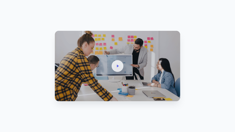
<img class="rounded-3xl shadow-2xl transition-shadow duration-300 ease-in-out" src="../assets/modal-video-thumb.jpg" width="768" height="432" alt="Modal video thumbnail" />
<!-- Play icon -->
<svg class="absolute pointer-events-none group-hover:scale-110 transition-transform duration-300 ease-in-out" xmlns="<http://www.w3.org/2000/svg>" width="72" height="72">
<circle class="fill-white" cx="36" cy="36" r="36" fill-opacity=".8" />
<path class="fill-indigo-500 drop-shadow-2xl" d="M44 36a.999.999 0 0 0-.427-.82l-10-7A1 1 0 0 0 32 29V43a.999.999 0 0 0 1.573.82l10-7A.995.995 0 0 0 44 36V36c0 .001 0 .001 0 0Z" />
</svg>
</button>
<!-- 2. The backdrop layer -->
<!-- 3. The modal video -->
</div>
</template>
Handling modal visibility and adding enter / leave transitions
At this point, we need to link the modal’s visibility to the modalOpen variable state and display it when true while hiding it when false. Additionally, we want the modal with the video to enter smoothly with a scale-up transition and exit with a scale-down.
Although Vue provides a built-in Transition component to accomplish this, we prefer using the Headless UI library because it offers a Dialog component that’s readily available and fully-accessible.
Let’s install the Headless UI for Vue version using the command npm install @headlessui/vue in the terminal and import the required components into our component file, which we’ll use as follows:
<script setup lang="ts">
import { ref } from 'vue'
import {
    Dialog,
    DialogPanel,
    TransitionRoot,
    TransitionChild,
} from '@headlessui/vue'

const modalOpen = ref<boolean>(false)
</script>

<template>
    <div>

        <!-- 1. The button -->
        <button
            class="relative flex justify-center items-center focus:outline-none focus-visible:ring focus-visible:ring-indigo-300 rounded-3xl group"
            @click="modalOpen = true"
            aria-label="Watch the video"
        >
            <img class="rounded-3xl shadow-2xl transition-shadow duration-300 ease-in-out" src="../assets/modal-video-thumb.jpg" width="768" height="432" alt="Modal video thumbnail" />
            <!-- Play icon -->
            <svg class="absolute pointer-events-none group-hover:scale-110 transition-transform duration-300 ease-in-out" xmlns="<http://www.w3.org/2000/svg>" width="72" height="72">
                <circle class="fill-white" cx="36" cy="36" r="36" fill-opacity=".8" />
                <path class="fill-indigo-500 drop-shadow-2xl" d="M44 36a.999.999 0 0 0-.427-.82l-10-7A1 1 0 0 0 32 29V43a.999.999 0 0 0 1.573.82l10-7A.995.995 0 0 0 44 36V36c0 .001 0 .001 0 0Z" />
            </svg>
        </button>

        <TransitionRoot :show="modalOpen" as="template">
            <Dialog @close="modalOpen = false">

                <!-- Modal backdrop -->
                <TransitionChild
                    className="fixed inset-0 z-[99999] bg-black bg-opacity-50 transition-opacity"
                    enter="transition ease-out duration-200"
                    enterFrom="opacity-0"
                    enterTo="opacity-100"
                    leave="transition ease-out duration-100"
                    leaveFrom="opacity-100"
                    leaveTo="opacity-0"
                    aria-hidden="true"
                />
                <!-- End: Modal backdrop -->

                <!-- Modal dialog -->
                <TransitionChild
                    className="fixed inset-0 z-[99999] flex p-6"
                    enter="transition ease-out duration-300"
                    enterFrom="opacity-0 scale-75"
                    enterTo="opacity-100 scale-100"
                    leave="transition ease-out duration-200"
                    leaveFrom="opacity-100 scale-100"
                    leaveTo="opacity-0 scale-75"
                >
                    <div class="max-w-5xl mx-auto h-full flex items-center">
                        <DialogPanel class="w-full max-h-full rounded-3xl shadow-2xl aspect-video bg-black overflow-hidden">
                            <video loop controls>
                                <source src="../assets/video.mp4" width="1920" height="1080" type="video/mp4" />
                                Your browser does not support the video tag.
                            </video>
                        </DialogPanel>
                    </div>
                </TransitionChild>
                <!-- End: Modal dialog -->

            </Dialog>
        </TransitionRoot>

    </div>
</template>
If you read our previous article on creating a video modal with Next.js, you may have noticed that the structure of this component is quite similar, but with some small differences:
- We have a
TransitionRootcomponent that contains both the backdrop and the modal, which can receive the modal’s state through theshowproperty and transmit it to the twoTransitionChildcomponents. - The
TransitionChildcomponents use theenter,enterFrom,enterTo,leave,leaveFrom, andleaveToproperties to define the CSS classes that define the entrance and exit transitions. - The
Dialogcomponent provides a@closeevent listener that allows us to set themodalOpenvariable to false when clicking outside the dialog element or pressing the escape key. By doing so, the modal will automatically close.
Although the component is fully functional at this point, some adjustments may still be necessary. For example, we may want the video to start playing automatically when the modal is opened. Let’s see how to do it.k
Playing the video automatically when the modal opens
To start, we need to reference the video element so that we can initiate playback. This is done using a ref. Then, leveraging the power of the Composition API, we can use a watcher that detects any changes in the modalOpen variable. This watcher will play the videoRef automatically when it appears in the DOM. Thanks to TypeScript, we can check the existence of videoRef with a single line of code:
watch(videoRef, () => {
    videoRef.value?.play()
})
Finally, we can use the initialFocus property provided by the Dialog component to give focus to the video when the modal is opened.
And here’s the final code:
<script setup lang="ts">
import { ref } from 'vue'
import {
    Dialog,
    DialogPanel,
    TransitionRoot,
    TransitionChild,
} from '@headlessui/vue'

const modalOpen = ref<boolean>(false)
const videoRef = ref<HTMLVideoElement | null>(null)

watch(videoRef, () => {
    videoRef.value?.play()
})
</script>

<template>
    <div>

        <!-- 1. The button -->
        <button
            class="relative flex justify-center items-center focus:outline-none focus-visible:ring focus-visible:ring-indigo-300 rounded-3xl group"
            @click="modalOpen = true"
            aria-label="Watch the video"
        >
            <img class="rounded-3xl shadow-2xl transition-shadow duration-300 ease-in-out" src="../assets/modal-video-thumb.jpg" width="768" height="432" alt="Modal video thumbnail" />
            <!-- Play icon -->
            <svg class="absolute pointer-events-none group-hover:scale-110 transition-transform duration-300 ease-in-out" xmlns="<http://www.w3.org/2000/svg>" width="72" height="72">
                <circle class="fill-white" cx="36" cy="36" r="36" fill-opacity=".8" />
                <path class="fill-indigo-500 drop-shadow-2xl" d="M44 36a.999.999 0 0 0-.427-.82l-10-7A1 1 0 0 0 32 29V43a.999.999 0 0 0 1.573.82l10-7A.995.995 0 0 0 44 36V36c0 .001 0 .001 0 0Z" />
            </svg>
        </button>

        <TransitionRoot :show="modalOpen" as="template">
            <Dialog :initialFocus="videoRef" @close="modalOpen = false">

                <!-- Modal backdrop -->
                <TransitionChild
                    className="fixed inset-0 z-[99999] bg-black bg-opacity-50 transition-opacity"
                    enter="transition ease-out duration-200"
                    enterFrom="opacity-0"
                    enterTo="opacity-100"
                    leave="transition ease-out duration-100"
                    leaveFrom="opacity-100"
                    leaveTo="opacity-0"
                    aria-hidden="true"
                />
                <!-- End: Modal backdrop -->

                <!-- Modal dialog -->
                <TransitionChild
                    className="fixed inset-0 z-[99999] flex p-6"
                    enter="transition ease-out duration-300"
                    enterFrom="opacity-0 scale-75"
                    enterTo="opacity-100 scale-100"
                    leave="transition ease-out duration-200"
                    leaveFrom="opacity-100 scale-100"
                    leaveTo="opacity-0 scale-75"
                >
                    <div class="max-w-5xl mx-auto h-full flex items-center">
                        <DialogPanel class="w-full max-h-full rounded-3xl shadow-2xl aspect-video bg-black overflow-hidden">
                            <video ref="videoRef" loop controls>
                                <source src="../assets/video.mp4" width="1920" height="1080" type="video/mp4" />
                                Your browser does not support the video tag.
                            </video>
                        </DialogPanel>
                    </div>
                </TransitionChild>
                <!-- End: Modal dialog -->

            </Dialog>
        </TransitionRoot>

    </div>
</template>
You can import and use the completed component in another component by using:
<ModalVideo />
Now, let’s explore how to modify the component to make it reusable by allowing for different thumbnails and videos to be passed in.
Making the modal video component reusable
The properties we want to pass to the ModalVideo component are:
- The source attribute (src) of the thumbnail image
- The dimensions of the thumbnail image
- The alternative text (alt) for the thumbnail image
- The source attribute (src) of the video
- The dimensions of the video
<ModalVideo
    :thumb="VideoThumb"
    :thumbWidth="768"
    :thumbHeight="432"
    :video="VideoSrc"
    :videoWidth="1920"
    :videoHeight="1080" />
Let’s now go back to the ModalVideo.vue file and list the properties, also defining an object with a TypeScript interface:
interface Props {
    thumb: string
    thumbWidth: number
    thumbHeight: number
    video: string
    videoWidth: number
    videoHeight: number
}

const props = defineProps<Props>()
Conclusions
So, here is the final result of the Modal Video component, built using Vue, TypeScript, and Tailwind CSS:
<script setup lang="ts">
import { ref, watch } from 'vue'
import {
    Dialog,
    DialogPanel,
    TransitionRoot,
    TransitionChild,
} from '@headlessui/vue'

const modalOpen = ref<boolean>(false)
const videoRef = ref<HTMLVideoElement | null>(null)

watch(videoRef, () => {
    videoRef.value?.play()
})

interface Props {
    thumb: string
    thumbWidth: number
    thumbHeight: number
    video: string
    videoWidth: number
    videoHeight: number
}

const props = defineProps<Props>()
</script>

<template>
    <div>

        <!-- Video thumbnail -->
        <button
            class="relative flex justify-center items-center focus:outline-none focus-visible:ring focus-visible:ring-indigo-300 rounded-3xl group"
            @click="modalOpen = true"
            aria-label="Watch the video"
        >
            <img class="rounded-3xl shadow-2xl transition-shadow duration-300 ease-in-out" :src="props.thumb" :width="props.thumbWidth" :height="props.thumbHeight" alt="Modal video thumbnail" />
            <!-- Play icon -->
            <svg class="absolute pointer-events-none group-hover:scale-110 transition-transform duration-300 ease-in-out" xmlns="<http://www.w3.org/2000/svg>" width="72" height="72">
                <circle class="fill-white" cx="36" cy="36" r="36" fill-opacity=".8" />
                <path class="fill-indigo-500 drop-shadow-2xl" d="M44 36a.999.999 0 0 0-.427-.82l-10-7A1 1 0 0 0 32 29V43a.999.999 0 0 0 1.573.82l10-7A.995.995 0 0 0 44 36V36c0 .001 0 .001 0 0Z" />
            </svg>
        </button>
        <!-- End: Video thumbnail -->

        <TransitionRoot :show="modalOpen" as="template">
            <Dialog :initialFocus="videoRef" @close="modalOpen = false">

                <!-- Modal backdrop -->
                <TransitionChild
                    className="fixed inset-0 z-[99999] bg-black bg-opacity-50 transition-opacity"
                    enter="transition ease-out duration-200"
                    enterFrom="opacity-0"
                    enterTo="opacity-100"
                    leave="transition ease-out duration-100"
                    leaveFrom="opacity-100"
                    leaveTo="opacity-0"
                    aria-hidden="true"
                />
                <!-- End: Modal backdrop -->

                <!-- Modal dialog -->
                <TransitionChild
                    className="fixed inset-0 z-[99999] flex p-6"
                    enter="transition ease-out duration-300"
                    enterFrom="opacity-0 scale-75"
                    enterTo="opacity-100 scale-100"
                    leave="transition ease-out duration-200"
                    leaveFrom="opacity-100 scale-100"
                    leaveTo="opacity-0 scale-75"
                >
                    <div class="max-w-5xl mx-auto h-full flex items-center">
                        <DialogPanel class="w-full max-h-full rounded-3xl shadow-2xl aspect-video bg-black overflow-hidden">
                            <video ref="videoRef" loop controls>
                                <source :src="props.video" :width="props.videoWidth" :height="props.videoHeight" type="video/mp4" />
                                Your browser does not support the video tag.
                            </video>
                        </DialogPanel>
                    </div>
                </TransitionChild>
                <!-- End: Modal dialog -->

            </Dialog>
        </TransitionRoot>

    </div>
</template>
As we discussed in the first and second parts of this series, you can use this component in a variety of ways (e.g., product tours, app presentations, etc.), as it works well with any type of website, landing page, or web app.
If you’re interested in learning how to build this component in Alpine.js and Next.js, check out the first and second parts of the series: