Animated Gradient Borders with Tailwind CSS
Animated border gradients have become a popular design trend, particularly on SaaS and startup landing pages. Inspired by this trend, we decided to create our own version using Tailwind CSS.
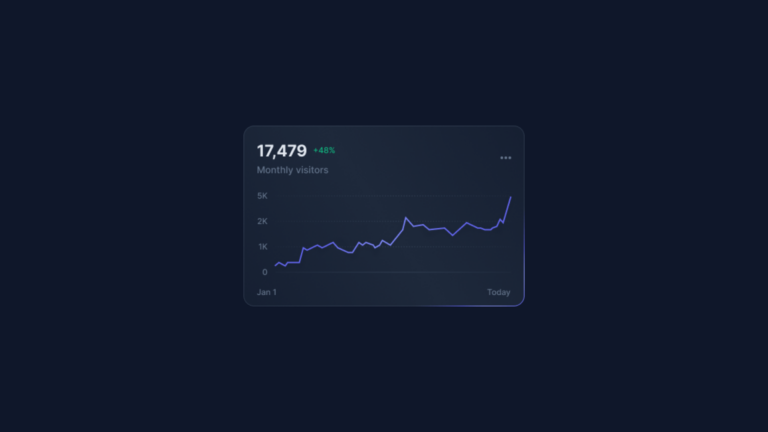
We made a card highlighted with this particular visual effect using only CSS. By leveraging Tailwind’s arbitrary properties we created a complex gradient, consisting of:
- A linear gradient with three stop-colors for the background
- A conic gradient with five stop-colors for the borders
Then, we added a CSS @property rule to control the angle of the conic gradient. This allowed us to animate the gradient with a new animation defined in the tailwind.config.js file.
Note: this animation is currently only supported in Chrome and Chromium-based browsers. Firefox does not yet support the CSS @property rule, but it is expected to be integrated soon, as it is already available in the nightly development version.
Code
<div class="w-full max-w-[422px] [background:linear-gradient(45deg,#172033,theme(colors.slate.800)_50%,#172033)_padding-box,conic-gradient(from_var(--border-angle),theme(colors.slate.600/.48)_80%,_theme(colors.indigo.500)_86%,_theme(colors.indigo.300)_90%,_theme(colors.indigo.500)_94%,_theme(colors.slate.600/.48))_border-box] rounded-2xl border border-transparent animate-border">
    <div class="p-5">
        <div class="flex justify-between items-center">
            <div>
                <div class="flex space-x-2 items-center mb-0.5">
                    <div class="text-2xl font-bold text-slate-200 mb-1">17,479</div>
                    <div class="text-xs font-medium text-emerald-500">+48%</div>
                </div>
                <div class="text-sm font-medium text-slate-500">Monthly visits</div>
            </div>
            <button class="w-8 h-8 flex justify-center items-center text-slate-500 hover:text-slate-400">
                <span class="sr-only">Open menu</span>
                <svg class="fill-current" xmlns="http://www.w3.org/2000/svg" width="16" height="4" fill="none">
                    <path d="M8 4a2 2 0 1 0 0-4 2 2 0 0 0 0 4ZM2 4a2 2 0 1 0 0-4 2 2 0 0 0 0 4ZM14 4a2 2 0 1 0 0-4 2 2 0 0 0 0 4Z"/>
                </svg>
            </button>
        </div>
    </div>
    <div class="px-5">
        <img class="group-hover:opacity-0 transition-opacity duration-500" src="./card-01.png" width="380" height="173" alt="Card image 01">
    </div>
</div>
Next, add this CSS to your stylesheet:
@property --border-angle {
    inherits: false;
    initial-value: 0deg;
    syntax: '<angle>';
}
Finally, add a new animation to your tailwind.config.js file:
tailwind.config = {
    theme: {
        extend: {
            animation: {
                'border': 'border 4s linear infinite',
            },
            keyframes: {
                'border': {
                    to: { '--border-angle': '360deg' },
                }
            }
        },
    },
};