Button Shine Effect on Hover with Tailwind CSS
At Cruip, we are obsessed with the little details, and that’s one of the reasons why so many developers have chosen our Tailwind templates. During the refinement stage, we focus on enhancing our designs with subtle effects to elevate the user experience while maintaining usability.
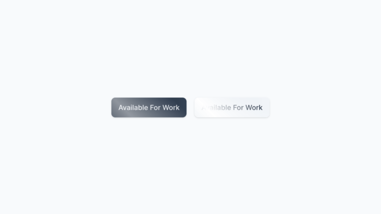
For instance, let’s take our DevFolio template. We wanted to make the buttons stand out with a shiny effect on hover. We made it with a subtle and smooth animation, and now we’re showing you a simple version that you can easily copy and paste in your projects.
In the snippet below, you’ll notice that both buttons share the same code. The only distinction is that one is enclosed in a div with the dark class, activating dark mode. This means you can also use them in websites with light and dark modes!
Code
<div class="flex gap-4">
    <div>
        <a class="inline-flex justify-center whitespace-nowrap rounded-lg px-3.5 py-2.5 text-sm font-medium text-slate-200 dark:text-slate-800 bg-gradient-to-r from-slate-800 to-slate-700 dark:from-slate-200 dark:to-slate-100 dark:hover:bg-slate-100 shadow focus:outline-none focus:ring focus:ring-slate-500/50 focus-visible:outline-none focus-visible:ring focus-visible:ring-slate-500/50 relative before:absolute before:inset-0 before:rounded-[inherit] before:bg-[linear-gradient(45deg,transparent_25%,theme(colors.white/.5)_50%,transparent_75%,transparent_100%)] dark:before:bg-[linear-gradient(45deg,transparent_25%,theme(colors.white)_50%,transparent_75%,transparent_100%)] before:bg-[length:250%_250%,100%_100%] before:bg-[position:200%_0,0_0] before:bg-no-repeat before:[transition:background-position_0s_ease] hover:before:bg-[position:-100%_0,0_0] hover:before:duration-[1500ms]" href="#0">Available For Work</a>
    </div>
    <div class="dark">
        <a class="inline-flex justify-center whitespace-nowrap rounded-lg px-3.5 py-2.5 text-sm font-medium text-slate-200 dark:text-slate-800 bg-gradient-to-r from-slate-800 to-slate-700 dark:from-slate-200 dark:to-slate-100 dark:hover:bg-slate-100 shadow focus:outline-none focus:ring focus:ring-slate-500/50 focus-visible:outline-none focus-visible:ring focus-visible:ring-slate-500/50 relative before:absolute before:inset-0 before:rounded-[inherit] before:bg-[linear-gradient(45deg,transparent_25%,theme(colors.white/.2)_50%,transparent_75%,transparent_100%)] dark:before:bg-[linear-gradient(45deg,transparent_25%,theme(colors.white)_50%,transparent_75%,transparent_100%)] before:bg-[length:250%_250%,100%_100%] before:bg-[position:200%_0,0_0] before:bg-no-repeat before:[transition:background-position_0s_ease] hover:before:bg-[position:-100%_0,0_0] hover:before:duration-[1500ms]" href="#0">Available For Work</a>
    </div>
</div>