Create an Animated Gradient Text with Tailwind CSS

Gradients are the one thing that will never go out of style in web design. You can see them everywhere, from backgrounds to images and texts. The variety of color combinations is endless, and the outcome is consistently attractive and modern.
We at Cruip love gradients. We use them on many of our Tailwind CSS templates and tutorials, and we are constantly looking for new ways to add a bit of colour to our designs.
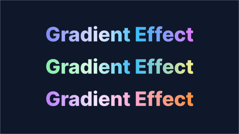
In this guide, we’ll show you how to create three text dynamic gradients, each with its own unique color scheme. As Tailwind CSS’s built-in utilities are limited to gradients with up to three color stops, we’ll also see how to create custom gradients using arbitrary values.
Are you ready? So, let’s dive in!
Creating the base text
Let’s begin with our main text. We’ll choose a basic paragraph and set the font size to 128px – using the class text-9xl – and make the text bold with the font-extrabold class. To apply the gradient to the text, we will add the bg-clip-text and text-transparent classes.
<p class="text-6xl md:text-9xl font-extrabold bg-clip-text text-transparent">Gradient Effect</p>This will be the basic structure used for all the examples in the demo.
Creating the gradient
Now, we’ll work on the first example. We want a gradient that moves from left to right made of four color stops:
- Indigo 400
- Indigo 100
- Sky 400
- Fuchsia 400
Given that Tailwind’s standard utilities (from-{color}, via-{color} and to-{color}) don’t support our four-color scheme, we’ll craft a custom class by using Tailwind’s arbitrary values.
To create this custom class, we first need to figure out how we’d create the gradient using standard CSS. In our case, it would be defined like this:
background-image: linear-gradient(to right,#818cf8,#e0e7ff,#38bdf8,#e879f9,#38bdf8,#e0e7ff,#818cf8)Next, let’s construct our custom class. We’ll start with the prefix bg- and then add square brackets. Within these brackets, we’ll insert our arbitrary value, replacing spaces with underscores:
bg-[linear-gradient(to_right,#818cf8,#e0e7ff,#38bdf8,#e879f9,#38bdf8,#e0e7ff,#818cf8)]Using colors from Tailwind’s palette
Our custom class is functioning smoothly. However, it can be refined by leveraging colors from Tailwind’s palette. We’ll achieve this by using the theme() function to select the specific colors we want from the palette.
The colors we’ll be using are colors.indigo.400, colors.indigo.100, colors.sky.400, and colors.fuchsia.400.
Our updated custom class will look like this:
bg-[linear-gradient(to_right,theme(colors.indigo.400),theme(colors.indigo.100),theme(colors.sky.400),theme(colors.fuchsia.400))]Making the pattern repeatable
Right now, our gradient starts with the color Indigo 400 and ends with Fuchsia 400. For a continuous, right-to-left flowing animation, we need a pattern where the start and end match perfectly.
To achieve this, we’ll place another gradient next to our current one, but with the colors reversed. This second gradient will start with Fuchsia 400 and end with Indigo 400.

So, we’ll modify our custom class like this:
bg-[linear-gradient(to_right,theme(colors.indigo.400),theme(colors.indigo.100),theme(colors.sky.400),theme(colors.fuchsia.400),theme(colors.sky.400),theme(colors.indigo.100),theme(colors.indigo.400))]Great! To position the gradient correctly and only display the first half (from Indigo 400 to Fuchsia 400), we’ll stretch its width to 200% using the class bg-[length:200%_auto]. The other half will be hidden, setting the stage for our scrolling animation.
Setting up the animation
At this point, crafting the animation with Tailwind CSS is a breeze: we aim for the gradient to roll from right to left endlessly.
Put simply, we want the background-position-x to gradually shift from 0 to 200% (remember, we’ve doubled the gradient’s width) without any interruptions.
To make it happen, we’ll design a custom animation in the tailwind.config.js file:
tailwind.config = {
  theme: {
    extend: {
      animation: {
        'gradient': 'gradient 8s linear infinite',
      },
      keyframes: {
        'gradient': {
          to: { 'background-position': '200% center' },
        }
      }
    },
  },
};
Now, to apply the animation to our paragraph, just add the class animate-gradient. Cool, right?
Exploring more gradients
Now that we’ve mastered the technique, we can craft endless gradients with various colors. Here are three other examples we’ve showcased in our demo:
<p class="text-6xl md:text-9xl font-extrabold bg-clip-text text-transparent bg-[linear-gradient(to_right,theme(colors.indigo.400),theme(colors.indigo.100),theme(colors.sky.400),theme(colors.fuchsia.400),theme(colors.sky.400),theme(colors.indigo.100),theme(colors.indigo.400))] bg-[length:200%_auto] animate-gradient">Gradient Effect</p>
<p class="text-6xl md:text-9xl font-extrabold bg-clip-text text-transparent bg-[linear-gradient(to_right,theme(colors.green.300),theme(colors.green.100),theme(colors.sky.400),theme(colors.yellow.200),theme(colors.sky.400),theme(colors.green.100),theme(colors.green.300))] bg-[length:200%_auto] animate-gradient">Gradient Effect</p>
<p class="text-6xl md:text-9xl font-extrabold bg-clip-text text-transparent bg-[linear-gradient(to_right,theme(colors.purple.400),theme(colors.purple.100),theme(colors.pink.300),theme(colors.orange.400),theme(colors.pink.300),theme(colors.purple.100),theme(colors.purple.400))] bg-[length:200%_auto] animate-gradient">Gradient Effect</p>
As you can see, it’s all about swapping out the color variables in the gradient-defining custom class!
Ad if you want to adjust the speed of the animation, tweak the 8s value in the tailwind.config.js file.
Conclusions
Use the technique to create your own gradient variations that match your unique brand and style.
If you enjoyed this guide, don’t forget to check out our Tailwind CSS tutorials, where we share plenty of useful guides for Tailwind CSS. Fo example, How to Make an Animated Counter with Tailwind CSS, or a How to Create a Sticky On Scroll Effect with JavaScript, and many more.
