How to Create a Spotlight Card Hover Effect with Tailwind CSS
Welcome to this tutorial where we’ll take you on a journey to create an eye-catching spotlight card hover effect using Tailwind CSS. If you’re new to this trending effect, we recommend checking out the live demo or our Dark Next.js landing page template called Stellar.
To begin, we’ll create the spotlight card using pure HTML and vanilla JavaScript. After that, we’ll take it a step further by showing you how to create a reusable component for Next.js and Vue.
Let’s get started!
Create the spotlight effect with HTML and vanilla JavaScript
As we usually do in our tutorials, we will start by creating a basic HTML document that will contain the structure of our animation. Then we will write the JavaScript code in an external JS file.
<!DOCTYPE html>
<html lang="en">
<head>
<meta charset="utf-8">
<title>Spotlight Effect</title>
<meta name="viewport" content="width=device-width,initial-scale=1">
<link rel="preconnect" href="https://fonts.googleapis.com">
<link rel="preconnect" href="https://fonts.gstatic.com" crossorigin>
<link href="https://fonts.googleapis.com/css2?family=Inter:wght@400;500;600;700;800&display=swap" rel="stylesheet">
<script src="https://cdn.tailwindcss.com"></script>
<script>
tailwind.config = {
theme: {
extend: {
fontFamily: {
inter: ['Inter', 'sans-serif'],
},
},
},
};
</script>
</head>
<body class="relative font-inter antialiased">
<main class="relative min-h-screen flex flex-col justify-center bg-slate-900 overflow-hidden">
<div class="w-full max-w-6xl mx-auto px-4 md:px-6 py-24">
<!-- Cards container -->
<div class="max-w-sm mx-auto grid gap-6 lg:grid-cols-3 items-start lg:max-w-none group">
<!-- Card 1 -->
<!-- Card 2 -->
<!-- Card 3 -->
</div>
<!-- End: Cards container -->
</div>
</main>
<script src="./spotlight-effect.js"></script>
</body>
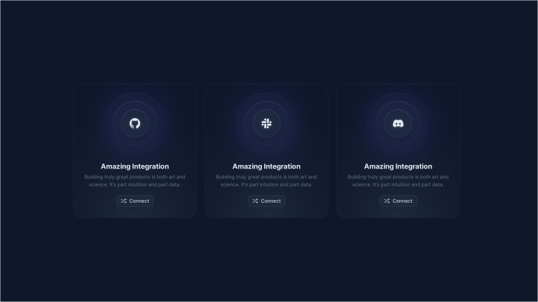
</html>We’ve created a very simple structure, with a container that will hold our cards. Now let’s start with coding one card, and then we’ll duplicate it to create the other two.
<div class="relative h-full bg-slate-800 rounded-3xl p-px before:absolute before:w-80 before:h-80 before:-left-40 before:-top-40 before:bg-slate-400 before:rounded-full before:opacity-0 before:pointer-events-none before:transition-opacity before:duration-500 before:translate-x-[var(--mouse-x)] before:translate-y-[var(--mouse-y)] before:group-hover:opacity-100 before:z-10 before:blur-[100px] after:absolute after:w-96 after:h-96 after:-left-48 after:-top-48 after:bg-indigo-500 after:rounded-full after:opacity-0 after:pointer-events-none after:transition-opacity after:duration-500 after:translate-x-[var(--mouse-x)] after:translate-y-[var(--mouse-y)] after:hover:opacity-10 after:z-30 after:blur-[100px] overflow-hidden">

    <!-- 1. Before pseudo element -->

    <!-- 2. Card content -->
    <div class="relative h-full bg-slate-900 p-6 pb-8 rounded-[inherit] z-20 overflow-hidden">
        <!-- Radial gradient -->
        <div class="absolute bottom-0 translate-y-1/2 left-1/2 -translate-x-1/2 pointer-events-none -z-10 w-1/2 aspect-square" aria-hidden="true">
            <div class="absolute inset-0 translate-z-0 bg-slate-800 rounded-full blur-[80px]"></div>
        </div>
        <div class="flex flex-col h-full items-center text-center">
            <!-- Image -->
            <div class="relative inline-flex">
                <div class="w-[40%] h-[40%] absolute inset-0 m-auto -translate-y-[10%] blur-3xl -z-10 rounded-full bg-indigo-600" aria-hidden="true"></div>
                <img class="inline-flex" src="./card-01.png" width="200" height="200" alt="Card 01" />
            </div>
            <!-- Text -->
            <div class="grow mb-5">
                <h2 class="text-xl text-slate-200 font-bold mb-1">Amazing Integration</h2>
                <p class="text-sm text-slate-500">Quickly apply filters to refine your issues lists and create custom views.</p>
            </div>
            <a class="inline-flex justify-center items-center whitespace-nowrap rounded-lg bg-slate-800 hover:bg-slate-900 border border-slate-700 px-3 py-1.5 text-sm font-medium text-slate-300 focus-visible:outline-none focus-visible:ring focus-visible:ring-indigo-300 dark:focus-visible:ring-slate-600 transition-colors duration-150" href="#0">
                <svg class="fill-slate-500 mr-2" xmlns="http://www.w3.org/2000/svg" width="16" height="14">
                    <path d="M12.82 8.116A.5.5 0 0 0 12 8.5V10h-.185a3 3 0 0 1-2.258-1.025l-.4-.457-1.328 1.519.223.255A5 5 0 0 0 11.815 12H12v1.5a.5.5 0 0 0 .82.384l3-2.5a.5.5 0 0 0 0-.768l-3-2.5ZM12.82.116A.5.5 0 0 0 12 .5V2h-.185a5 5 0 0 0-3.763 1.708L3.443 8.975A3 3 0 0 1 1.185 10H1a1 1 0 1 0 0 2h.185a5 5 0 0 0 3.763-1.708l4.609-5.267A3 3 0 0 1 11.815 4H12v1.5a.5.5 0 0 0 .82.384l3-2.5a.5.5 0 0 0 0-.768l-3-2.5ZM1 4h.185a3 3 0 0 1 2.258 1.025l.4.457 1.328-1.52-.223-.254A5 5 0 0 0 1.185 2H1a1 1 0 0 0 0 2Z" />
                </svg>
                <span>Connect</span>
            </a>
        </div>
    </div>

    <!-- 3. After pseudo element -->

</div>
We’ve added a lot of classes to the card, but don’t worry, we’ll go through them one by one.
Add a card border
In our first div, we’ve added a bg-slate-800 to define a dark background color. Then, we’ve added a p-px class to add a 1px padding to the card, and the card content has the same background color of the page. Doing that, we’re creating a fake 1px border around the card.
The reason why we’re not using conventional CSS borders is that they won’t allow us to create the effect we want to achieve.
Now, let’s move on with the before and after pseudo elements. We will use the before and after prefixes provided by Tailwind CSS to create them, and define their style.
The before pseudo element will be used to lighten the borders of our cards on mouse hover, while the after pseudo element will be used for the spotlight effect above the card.
Use the before pseudo element for the card border
Let’s see how it works the before pseudo element. It’s a layer placed below the card content, and it’s absolutely positioned to cover the entire card. It’s visible for 1px on the card sides, and that “lightens” the card borders with a lighter gray color (slate 400) on mouse hover.
The key Tailwind CSS classes of this element are:
before:opacity-0 before:group-hover:opacity-100: thebeforepseudo element is hidden by default, and it’s visible only when the card container is hovered. Note that we’re using a Tailwind CSSgroup-hovervariant, so you want to make sure to add thegroupclass to the card parent element.before:translate-x-[var(--mouse-x)] before:translate-y-[var(--mouse-y)]: this class defines the position of thebeforepseudo element. We’re using Tailwind’s arbitrary properties to set thetranslate-xandtranslate-yCSS properties to the mouse position. This way, thebeforepseudo element will follow the mouse cursor.
Use the after element for the spotlight
The after pseudo element is used to create the spotlight effect. It’s a layer placed above the card content, and it’s absolutely positioned to cover the entire card.
The code looks much like the before pseudo element, but there are a few differences:
- The blurred circle looks a bit bigger (
after:w-96 after:h-96) - The background color is different (
after:bg-indigo-500) and the target opacity is lower (after:hover:opacity-10) - We’ll make the spotlight appear when hovering the single card, not the card container as we did for the
beforepseudo element
Cool! Now, when you hover the card, you should see the spotlight effect and the card borders lightening in the top left corner.
As you may guess, we want to animate the spotlight effect, so let’s add some JavaScript.
Make the spotlight follow the mouse cursor
As you already know, we used translate-x-[var(--mouse-x)] and translate-y-[var(--mouse-y)] to set the position of both before and after pseudo element. In other words, we used --mouse-x and --mouse-x CSS variables to set the position of the elements instead of using a fixed value.
Now we want to update the value of those CSS variables on mouse move, so that the spotlight will follow the mouse cursor. We’ll use a bit of JavaScript to do that.
Let’s create a JavaScript class called Spotlight inside our spotlight-effect.js file:
// Cards spotlight
class Spotlight {
  constructor(containerElement) {
    this.container = containerElement;
    this.cards = Array.from(this.container.children);
    this.mouse = {
      x: 0,
      y: 0,
    };
    this.containerSize = {
      w: 0,
      h: 0,
    };
    this.initContainer = this.initContainer.bind(this);
    this.onMouseMove = this.onMouseMove.bind(this);
    this.init();
  }

  initContainer() {
    this.containerSize.w = this.container.offsetWidth;
    this.containerSize.h = this.container.offsetHeight;
  }

  onMouseMove(event) {
    const { clientX, clientY } = event;
    const rect = this.container.getBoundingClientRect();
    const { w, h } = this.containerSize;
    const x = clientX - rect.left;
    const y = clientY - rect.top;
    const inside = x < w && x > 0 && y < h && y > 0;
    if (inside) {
      this.mouse.x = x;
      this.mouse.y = y;
      this.cards.forEach((card) => {
        const cardX = -(card.getBoundingClientRect().left - rect.left) + this.mouse.x;
        const cardY = -(card.getBoundingClientRect().top - rect.top) + this.mouse.y;
        card.style.setProperty('--mouse-x', `${cardX}px`);
        card.style.setProperty('--mouse-y', `${cardY}px`);
      });
    }
  }

  init() {
    this.initContainer();
    window.addEventListener('resize', this.initContainer);
    window.addEventListener('mousemove', this.onMouseMove);
  }
}

// Init Spotlight
const spotlights = document.querySelectorAll('[data-spotlight]');
spotlights.forEach((spotlight) => {
  new Spotlight(spotlight);
});
We won’t go into the details of the code, but here’s a quick overview of what it does:
- It creates a
Spotlightinstance for each element with thedata-spotlightattribute, which is supposed to be the container holding the cards - When hovering the card container, it sets
--mouse-xand--mouse-yCSS variables on each card - It updates
--mouse-xand--mouse-yvalues on mouse move, but only if the mouse cursor is inside the card container
That way, the translate-x and translate-y values of the before and after pseudo elements will be updated on mouse move, and the spotlight will follow the mouse cursor.
Finally, ensure to add the data-spotlight attribute to the card container, and add the cards as first-level children of the container:
<div class="max-w-sm mx-auto grid gap-6 lg:grid-cols-3 items-start lg:max-w-none group" data-spotlight>

    <!-- Card 1 -->
    <div class="relative h-full bg-slate-800 rounded-3xl p-px before:absolute before:w-80 before:h-80 before:-left-40 before:-top-40 before:bg-slate-400 before:rounded-full before:opacity-0 before:pointer-events-none before:transition-opacity before:duration-500 before:translate-x-[var(--mouse-x)] before:translate-y-[var(--mouse-y)] before:group-hover:opacity-100 before:z-10 before:blur-[100px] after:absolute after:w-96 after:h-96 after:-left-48 after:-top-48 after:bg-indigo-500 after:rounded-full after:opacity-0 after:pointer-events-none after:transition-opacity after:duration-500 after:translate-x-[var(--mouse-x)] after:translate-y-[var(--mouse-y)] after:hover:opacity-10 after:z-30 after:blur-[100px] overflow-hidden">
        <div class="relative h-full bg-slate-900 p-6 pb-8 rounded-[inherit] z-20 overflow-hidden">
            <!-- Radial gradient -->
            <div class="absolute bottom-0 translate-y-1/2 left-1/2 -translate-x-1/2 pointer-events-none -z-10 w-1/2 aspect-square" aria-hidden="true">
                <div class="absolute inset-0 translate-z-0 bg-slate-800 rounded-full blur-[80px]"></div>
            </div>
            <div class="flex flex-col h-full items-center text-center">
                <!-- Image -->
                <div class="relative inline-flex">
                    <div class="w-[40%] h-[40%] absolute inset-0 m-auto -translate-y-[10%] blur-3xl -z-10 rounded-full bg-indigo-600" aria-hidden="true"></div>
                    <img class="inline-flex" src="./card-01.png" width="200" height="200" alt="Card 01" />
                </div>
                <!-- Text -->
                <div class="grow mb-5">
                    <h2 class="text-xl text-slate-200 font-bold mb-1">Amazing Integration</h2>
                    <p class="text-sm text-slate-500">Quickly apply filters to refine your issues lists and create custom views.</p>
                </div>
                <a class="inline-flex justify-center items-center whitespace-nowrap rounded-lg bg-slate-800 hover:bg-slate-900 border border-slate-700 px-3 py-1.5 text-sm font-medium text-slate-300 focus-visible:outline-none focus-visible:ring focus-visible:ring-indigo-300 dark:focus-visible:ring-slate-600 transition-colors duration-150" href="#0">
                    <svg class="fill-slate-500 mr-2" xmlns="http://www.w3.org/2000/svg" width="16" height="14">
                        <path d="M12.82 8.116A.5.5 0 0 0 12 8.5V10h-.185a3 3 0 0 1-2.258-1.025l-.4-.457-1.328 1.519.223.255A5 5 0 0 0 11.815 12H12v1.5a.5.5 0 0 0 .82.384l3-2.5a.5.5 0 0 0 0-.768l-3-2.5ZM12.82.116A.5.5 0 0 0 12 .5V2h-.185a5 5 0 0 0-3.763 1.708L3.443 8.975A3 3 0 0 1 1.185 10H1a1 1 0 1 0 0 2h.185a5 5 0 0 0 3.763-1.708l4.609-5.267A3 3 0 0 1 11.815 4H12v1.5a.5.5 0 0 0 .82.384l3-2.5a.5.5 0 0 0 0-.768l-3-2.5ZM1 4h.185a3 3 0 0 1 2.258 1.025l.4.457 1.328-1.52-.223-.254A5 5 0 0 0 1.185 2H1a1 1 0 0 0 0 2Z" />
                    </svg>
                    <span>Connect</span>
                </a>
            </div>
        </div>
    </div>

    <!-- Card 2 -->
    <div class="relative h-full bg-slate-800 rounded-3xl p-px before:absolute before:w-80 before:h-80 before:-left-40 before:-top-40 before:bg-slate-400 before:rounded-full before:opacity-0 before:pointer-events-none before:transition-opacity before:duration-500 before:translate-x-[var(--mouse-x)] before:translate-y-[var(--mouse-y)] before:group-hover:opacity-100 before:z-10 before:blur-[100px] after:absolute after:w-96 after:h-96 after:-left-48 after:-top-48 after:bg-indigo-500 after:rounded-full after:opacity-0 after:pointer-events-none after:transition-opacity after:duration-500 after:translate-x-[var(--mouse-x)] after:translate-y-[var(--mouse-y)] after:hover:opacity-10 after:z-30 after:blur-[100px] overflow-hidden">
        <div class="relative h-full bg-slate-900 p-6 pb-8 rounded-[inherit] z-20 overflow-hidden">
            <!-- Radial gradient -->
            <div class="absolute bottom-0 translate-y-1/2 left-1/2 -translate-x-1/2 pointer-events-none -z-10 w-1/2 aspect-square" aria-hidden="true">
                <div class="absolute inset-0 translate-z-0 bg-slate-800 rounded-full blur-[80px]"></div>
            </div>
            <div class="flex flex-col h-full items-center text-center">
                <!-- Image -->
                <div class="relative inline-flex">
                    <div class="w-[40%] h-[40%] absolute inset-0 m-auto -translate-y-[10%] blur-3xl -z-10 rounded-full bg-indigo-600" aria-hidden="true"></div>
                    <img class="inline-flex" src="./card-02.png" width="200" height="200" alt="Card 02" />
                </div>
                <!-- Text -->
                <div class="grow mb-5">
                    <h2 class="text-xl text-slate-200 font-bold mb-1">Amazing Integration</h2>
                    <p class="text-sm text-slate-500">Quickly apply filters to refine your issues lists and create custom views.</p>
                </div>
                <a class="inline-flex justify-center items-center whitespace-nowrap rounded-lg bg-slate-800 hover:bg-slate-900 border border-slate-700 px-3 py-1.5 text-sm font-medium text-slate-300 focus-visible:outline-none focus-visible:ring focus-visible:ring-indigo-300 dark:focus-visible:ring-slate-600 transition-colors duration-150" href="#0">
                    <svg class="fill-slate-500 mr-2" xmlns="http://www.w3.org/2000/svg" width="16" height="14">
                        <path d="M12.82 8.116A.5.5 0 0 0 12 8.5V10h-.185a3 3 0 0 1-2.258-1.025l-.4-.457-1.328 1.519.223.255A5 5 0 0 0 11.815 12H12v1.5a.5.5 0 0 0 .82.384l3-2.5a.5.5 0 0 0 0-.768l-3-2.5ZM12.82.116A.5.5 0 0 0 12 .5V2h-.185a5 5 0 0 0-3.763 1.708L3.443 8.975A3 3 0 0 1 1.185 10H1a1 1 0 1 0 0 2h.185a5 5 0 0 0 3.763-1.708l4.609-5.267A3 3 0 0 1 11.815 4H12v1.5a.5.5 0 0 0 .82.384l3-2.5a.5.5 0 0 0 0-.768l-3-2.5ZM1 4h.185a3 3 0 0 1 2.258 1.025l.4.457 1.328-1.52-.223-.254A5 5 0 0 0 1.185 2H1a1 1 0 0 0 0 2Z" />
                    </svg>
                    <span>Connect</span>
                </a>
            </div>
        </div>
    </div>

    <!-- Card 3 -->
    <div class="relative h-full bg-slate-800 rounded-3xl p-px before:absolute before:w-80 before:h-80 before:-left-40 before:-top-40 before:bg-slate-400 before:rounded-full before:opacity-0 before:pointer-events-none before:transition-opacity before:duration-500 before:translate-x-[var(--mouse-x)] before:translate-y-[var(--mouse-y)] before:group-hover:opacity-100 before:z-10 before:blur-[100px] after:absolute after:w-96 after:h-96 after:-left-48 after:-top-48 after:bg-indigo-500 after:rounded-full after:opacity-0 after:pointer-events-none after:transition-opacity after:duration-500 after:translate-x-[var(--mouse-x)] after:translate-y-[var(--mouse-y)] after:hover:opacity-10 after:z-30 after:blur-[100px] overflow-hidden">
        <div class="relative h-full bg-slate-900 p-6 pb-8 rounded-[inherit] z-20 overflow-hidden">
            <!-- Radial gradient -->
            <div class="absolute bottom-0 translate-y-1/2 left-1/2 -translate-x-1/2 pointer-events-none -z-10 w-1/2 aspect-square" aria-hidden="true">
                <div class="absolute inset-0 translate-z-0 bg-slate-800 rounded-full blur-[80px]"></div>
            </div>
            <div class="flex flex-col h-full items-center text-center">
                <!-- Image -->
                <div class="relative inline-flex">
                    <div class="w-[40%] h-[40%] absolute inset-0 m-auto -translate-y-[10%] blur-3xl -z-10 rounded-full bg-indigo-600" aria-hidden="true"></div>
                    <img class="inline-flex" src="./card-03.png" width="200" height="200" alt="Card 03" />
                </div>
                <!-- Text -->
                <div class="grow mb-5">
                    <h2 class="text-xl text-slate-200 font-bold mb-1">Amazing Integration</h2>
                    <p class="text-sm text-slate-500">Quickly apply filters to refine your issues lists and create custom views.</p>
                </div>
                <a class="inline-flex justify-center items-center whitespace-nowrap rounded-lg bg-slate-800 hover:bg-slate-900 border border-slate-700 px-3 py-1.5 text-sm font-medium text-slate-300 focus-visible:outline-none focus-visible:ring focus-visible:ring-indigo-300 dark:focus-visible:ring-slate-600 transition-colors duration-150" href="#0">
                    <svg class="fill-slate-500 mr-2" xmlns="http://www.w3.org/2000/svg" width="16" height="14">
                        <path d="M12.82 8.116A.5.5 0 0 0 12 8.5V10h-.185a3 3 0 0 1-2.258-1.025l-.4-.457-1.328 1.519.223.255A5 5 0 0 0 11.815 12H12v1.5a.5.5 0 0 0 .82.384l3-2.5a.5.5 0 0 0 0-.768l-3-2.5ZM12.82.116A.5.5 0 0 0 12 .5V2h-.185a5 5 0 0 0-3.763 1.708L3.443 8.975A3 3 0 0 1 1.185 10H1a1 1 0 1 0 0 2h.185a5 5 0 0 0 3.763-1.708l4.609-5.267A3 3 0 0 1 11.815 4H12v1.5a.5.5 0 0 0 .82.384l3-2.5a.5.5 0 0 0 0-.768l-3-2.5ZM1 4h.185a3 3 0 0 1 2.258 1.025l.4.457 1.328-1.52-.223-.254A5 5 0 0 0 1.185 2H1a1 1 0 0 0 0 2Z" />
                    </svg>
                    <span>Connect</span>
                </a>
            </div>
        </div>
    </div>

</div>
Create a reusable Spotlight component for Next.js
Now that we have a working spotlight effect, let’s create a reusable component for Next.js with TypeScript support. The component we are going to build is available in our GitHub repository that includes all Next.js examples from our tutorials.
Let’s create a new file called spotlight.tsx inside the components folder. Since we have a container and some cards inside it, we are going to create two components for them:
Spotlightis the main component, and it handles the full logic.SpotlightCardis just a wrapper for the card content. It accepts aclassNameprop that will be applied to the card container, and achildrenprop that will be the card content.
'use client'

import React, { useRef, useState, useEffect } from 'react'
import MousePosition from './utils/mouse-position'

type SpotlightProps = {
  children: React.ReactNode
  className?: string
}

export default function Spotlight({
  children,
  className = '',
}: SpotlightProps) {

  const containerRef = useRef<HTMLDivElement>(null)
  const mousePosition = MousePosition()
  const mouse = useRef<{ x: number; y: number }>({ x: 0, y: 0 })
  const containerSize = useRef<{ w: number; h: number }>({ w: 0, h: 0 })
  const [boxes, setBoxes] = useState<Array<HTMLElement>>([])

  useEffect(() => {
    containerRef.current && setBoxes(Array.from(containerRef.current.children).map((el) => el as HTMLElement))
  }, [])

  useEffect(() => {
    initContainer()
    window.addEventListener('resize', initContainer)

    return () => {
      window.removeEventListener('resize', initContainer)
    }
  }, [setBoxes])

  useEffect(() => {
    onMouseMove()
  }, [mousePosition])

  const initContainer = () => {
    if(containerRef.current) {
      containerSize.current.w = containerRef.current.offsetWidth
      containerSize.current.h = containerRef.current.offsetHeight
    }
  }

  const onMouseMove = () => {
    if (containerRef.current) {
      const rect = containerRef.current.getBoundingClientRect()
      const { w, h } = containerSize.current
      const x = mousePosition.x - rect.left
      const y = mousePosition.y - rect.top
      const inside = x < w && x > 0 && y < h && y > 0
      if (inside) {
        mouse.current.x = x
        mouse.current.y = y
        boxes.forEach((box) => {
          const boxX = -(box.getBoundingClientRect().left - rect.left) + mouse.current.x
          const boxY = -(box.getBoundingClientRect().top - rect.top) + mouse.current.y
          box.style.setProperty('--mouse-x', `${boxX}px`)
          box.style.setProperty('--mouse-y', `${boxY}px`)
        })
      }
    }
  }

  return (
    <div className={className} ref={containerRef}>{children}</div>
  )
}

type SpotlightCardProps = {
  children: React.ReactNode,
  className?: string
}

export function SpotlightCard({
  children,
  className = ''
}: SpotlightCardProps) {
  return <div className={`relative h-full bg-slate-800 rounded-3xl p-px before:absolute before:w-80 before:h-80 before:-left-40 before:-top-40 before:bg-slate-400 before:rounded-full before:opacity-0 before:pointer-events-none before:transition-opacity before:duration-500 before:translate-x-[var(--mouse-x)] before:translate-y-[var(--mouse-y)] before:group-hover:opacity-100 before:z-10 before:blur-[100px] after:absolute after:w-96 after:h-96 after:-left-48 after:-top-48 after:bg-indigo-500 after:rounded-full after:opacity-0 after:pointer-events-none after:transition-opacity after:duration-500 after:translate-x-[var(--mouse-x)] after:translate-y-[var(--mouse-y)] after:hover:opacity-10 after:z-30 after:blur-[100px] overflow-hidden ${className}`}>{children}</div>
}
As you can see, the code looks much like the one we used in the previous section. We’ve just added some TypeScript annotations, and imported the mouse-position.tsx component – that we previously created for another tutorial – to get the mouse position.
We can now import and use them in a page or in another component, just like this:
<Spotlight className="max-w-sm mx-auto grid gap-6 lg:grid-cols-3 items-start lg:max-w-none group">
  {/* Card #1 */}
  <SpotlightCard>
    <div className="relative h-full bg-slate-900 p-6 pb-8 rounded-[inherit] z-20 overflow-hidden">
      {/* Radial gradient */}
      <div className="absolute bottom-0 translate-y-1/2 left-1/2 -translate-x-1/2 pointer-events-none -z-10 w-1/2 aspect-square" aria-hidden="true">
        <div className="absolute inset-0 translate-z-0 bg-slate-800 rounded-full blur-[80px]"></div>
      </div>
      <div className="flex flex-col h-full items-center text-center">
        {/* Image */}
        <div className="relative inline-flex">
          <div className="w-[40%] h-[40%] absolute inset-0 m-auto -translate-y-[10%] blur-3xl -z-10 rounded-full bg-indigo-600" aria-hidden="true"></div>
          <Image className="inline-flex" src={Card01} width={200} height={200} alt="Card 01" />
        </div>
        {/* Text */}
        <div className="grow mb-5">
          <h2 className="text-xl text-slate-200 font-bold mb-1">Amazing Integration</h2>
          <p className="text-sm text-slate-500">Quickly apply filters to refine your issues lists and create custom views.</p>
        </div>
        <a className="inline-flex justify-center items-center whitespace-nowrap rounded-lg bg-slate-800 hover:bg-slate-900 border border-slate-700 px-3 py-1.5 text-sm font-medium text-slate-300 focus-visible:outline-none focus-visible:ring focus-visible:ring-indigo-300 dark:focus-visible:ring-slate-600 transition-colors duration-150" href="#0">
          <svg className="fill-slate-500 mr-2" xmlns="http://www.w3.org/2000/svg" width="16" height="14">
            <path d="M12.82 8.116A.5.5 0 0 0 12 8.5V10h-.185a3 3 0 0 1-2.258-1.025l-.4-.457-1.328 1.519.223.255A5 5 0 0 0 11.815 12H12v1.5a.5.5 0 0 0 .82.384l3-2.5a.5.5 0 0 0 0-.768l-3-2.5ZM12.82.116A.5.5 0 0 0 12 .5V2h-.185a5 5 0 0 0-3.763 1.708L3.443 8.975A3 3 0 0 1 1.185 10H1a1 1 0 1 0 0 2h.185a5 5 0 0 0 3.763-1.708l4.609-5.267A3 3 0 0 1 11.815 4H12v1.5a.5.5 0 0 0 .82.384l3-2.5a.5.5 0 0 0 0-.768l-3-2.5ZM1 4h.185a3 3 0 0 1 2.258 1.025l.4.457 1.328-1.52-.223-.254A5 5 0 0 0 1.185 2H1a1 1 0 0 0 0 2Z" />
          </svg>
          <span>Connect</span>
        </a>
      </div>
    </div>
  </SpotlightCard>
  {/* Card #2 */}
  <SpotlightCard>
    <div className="relative h-full bg-slate-900 p-6 pb-8 rounded-[inherit] z-20 overflow-hidden">
      {/* Radial gradient */}
      <div className="absolute bottom-0 translate-y-1/2 left-1/2 -translate-x-1/2 pointer-events-none -z-10 w-1/2 aspect-square" aria-hidden="true">
        <div className="absolute inset-0 translate-z-0 bg-slate-800 rounded-full blur-[80px]"></div>
      </div>
      <div className="flex flex-col h-full items-center text-center">
        {/* Image */}
        <div className="relative inline-flex">
          <div className="w-[40%] h-[40%] absolute inset-0 m-auto -translate-y-[10%] blur-3xl -z-10 rounded-full bg-indigo-600" aria-hidden="true"></div>
          <Image className="inline-flex" src={Card02} width={200} height={200} alt="Card 02" />
        </div>
        {/* Text */}
        <div className="grow mb-5">
          <h2 className="text-xl text-slate-200 font-bold mb-1">Amazing Integration</h2>
          <p className="text-sm text-slate-500">Quickly apply filters to refine your issues lists and create custom views.</p>
        </div>
        <a className="inline-flex justify-center items-center whitespace-nowrap rounded-lg bg-slate-800 hover:bg-slate-900 border border-slate-700 px-3 py-1.5 text-sm font-medium text-slate-300 focus-visible:outline-none focus-visible:ring focus-visible:ring-indigo-300 dark:focus-visible:ring-slate-600 transition-colors duration-150" href="#0">
          <svg className="fill-slate-500 mr-2" xmlns="http://www.w3.org/2000/svg" width="16" height="14">
            <path d="M12.82 8.116A.5.5 0 0 0 12 8.5V10h-.185a3 3 0 0 1-2.258-1.025l-.4-.457-1.328 1.519.223.255A5 5 0 0 0 11.815 12H12v1.5a.5.5 0 0 0 .82.384l3-2.5a.5.5 0 0 0 0-.768l-3-2.5ZM12.82.116A.5.5 0 0 0 12 .5V2h-.185a5 5 0 0 0-3.763 1.708L3.443 8.975A3 3 0 0 1 1.185 10H1a1 1 0 1 0 0 2h.185a5 5 0 0 0 3.763-1.708l4.609-5.267A3 3 0 0 1 11.815 4H12v1.5a.5.5 0 0 0 .82.384l3-2.5a.5.5 0 0 0 0-.768l-3-2.5ZM1 4h.185a3 3 0 0 1 2.258 1.025l.4.457 1.328-1.52-.223-.254A5 5 0 0 0 1.185 2H1a1 1 0 0 0 0 2Z" />
          </svg>
          <span>Connect</span>
        </a>
      </div>
    </div>
  </SpotlightCard>
  {/* Card #3 */}
  <SpotlightCard>
    <div className="relative h-full bg-slate-900 p-6 pb-8 rounded-[inherit] z-20 overflow-hidden">
      {/* Radial gradient */}
      <div className="absolute bottom-0 translate-y-1/2 left-1/2 -translate-x-1/2 pointer-events-none -z-10 w-1/2 aspect-square" aria-hidden="true">
        <div className="absolute inset-0 translate-z-0 bg-slate-800 rounded-full blur-[80px]"></div>
      </div>
      <div className="flex flex-col h-full items-center text-center">
        {/* Image */}
        <div className="relative inline-flex">
          <div className="w-[40%] h-[40%] absolute inset-0 m-auto -translate-y-[10%] blur-3xl -z-10 rounded-full bg-indigo-600" aria-hidden="true"></div>
          <Image className="inline-flex" src={Card03} width={200} height={200} alt="Card 03" />
        </div>
        {/* Text */}
        <div className="grow mb-5">
          <h2 className="text-xl text-slate-200 font-bold mb-1">Amazing Integration</h2>
          <p className="text-sm text-slate-500">Quickly apply filters to refine your issues lists and create custom views.</p>
        </div>
        <a className="inline-flex justify-center items-center whitespace-nowrap rounded-lg bg-slate-800 hover:bg-slate-900 border border-slate-700 px-3 py-1.5 text-sm font-medium text-slate-300 focus-visible:outline-none focus-visible:ring focus-visible:ring-indigo-300 dark:focus-visible:ring-slate-600 transition-colors duration-150" href="#0">
          <svg className="fill-slate-500 mr-2" xmlns="http://www.w3.org/2000/svg" width="16" height="14">
            <path d="M12.82 8.116A.5.5 0 0 0 12 8.5V10h-.185a3 3 0 0 1-2.258-1.025l-.4-.457-1.328 1.519.223.255A5 5 0 0 0 11.815 12H12v1.5a.5.5 0 0 0 .82.384l3-2.5a.5.5 0 0 0 0-.768l-3-2.5ZM12.82.116A.5.5 0 0 0 12 .5V2h-.185a5 5 0 0 0-3.763 1.708L3.443 8.975A3 3 0 0 1 1.185 10H1a1 1 0 1 0 0 2h.185a5 5 0 0 0 3.763-1.708l4.609-5.267A3 3 0 0 1 11.815 4H12v1.5a.5.5 0 0 0 .82.384l3-2.5a.5.5 0 0 0 0-.768l-3-2.5ZM1 4h.185a3 3 0 0 1 2.258 1.025l.4.457 1.328-1.52-.223-.254A5 5 0 0 0 1.185 2H1a1 1 0 0 0 0 2Z" />
          </svg>
          <span>Connect</span>
        </a>
      </div>
    </div>
  </SpotlightCard>
</Spotlight>
Create a Vue Spotlight component
As a final step, we are going to create a reusable component for Vue with TypeScript support, that is available in our GitHub repository, which includes all the examples from the Cruip tutorials.
Let’s create a new file called Spotlight.vue inside the components folder.
<script setup lang="ts">
import { ref, onMounted, onBeforeUnmount, reactive, watch } from 'vue'
import useMousePosition from './utils/MousePosition'

const containerRef = ref<HTMLCanvasElement | null>(null)
const mousePosition = useMousePosition()
const mouse = reactive<{ x: number; y: number }>({ x: 0, y: 0 })
const containerSize = reactive<{ w: number; h: number }>({ w: 0, h: 0 })
const boxes = ref<any[]>([])

onMounted(() => {
  if (containerRef.value) {
    boxes.value = Array.from(containerRef.value.children)
  }
  initContainer()
  window.addEventListener('resize', initContainer)
})

onBeforeUnmount(() => {
  window.removeEventListener('resize', initContainer)
})

watch(
  () => mousePosition.value,
  () => {
    onMouseMove()
  }
)

const initContainer = () => {
  if (containerRef.value) {
    containerSize.w = containerRef.value.offsetWidth
    containerSize.h = containerRef.value.offsetHeight
  }
}

const onMouseMove = () => {
  if (containerRef.value) {
    const rect = containerRef.value.getBoundingClientRect()
    const { w, h } = containerSize
    const x = mousePosition.value.x - rect.left
    const y = mousePosition.value.y - rect.top
    const inside = x < w && x > 0 && y < h && y > 0
    if (inside) {
      mouse.x = x
      mouse.y = y
      boxes.value.forEach((box) => {
        const boxX = -(box.getBoundingClientRect().left - rect.left) + mouse.x
        const boxY = -(box.getBoundingClientRect().top - rect.top) + mouse.y
        box.style.setProperty('--mouse-x', `${boxX}px`)
        box.style.setProperty('--mouse-y', `${boxY}px`)
      })
    }
  }
}
</script>


<template>
  <div ref="containerRef">
    <slot></slot>
  </div>
</template>
As you can see, we are using the MousePosition.ts component – that we previously built for the particle animation tutorial – which gets the mouse coordinates.
Then, we need a separate component for each box, which we are going to call SpotlightCard.vue:
<template>
  <div class="relative h-full bg-slate-800 rounded-3xl p-px before:absolute before:w-80 before:h-80 before:-left-40 before:-top-40 before:bg-slate-400 before:rounded-full before:opacity-0 before:pointer-events-none before:transition-opacity before:duration-500 before:translate-x-[var(--mouse-x)] before:translate-y-[var(--mouse-y)] before:group-hover:opacity-100 before:z-10 before:blur-[100px] after:absolute after:w-96 after:h-96 after:-left-48 after:-top-48 after:bg-indigo-500 after:rounded-full after:opacity-0 after:pointer-events-none after:transition-opacity after:duration-500 after:translate-x-[var(--mouse-x)] after:translate-y-[var(--mouse-y)] after:hover:opacity-10 after:z-30 after:blur-[100px] overflow-hidden">
    <slot></slot>
  </div>
</template>
Finally, we can use the Spotlight.vue and SpotlightCard.vue components in our pages:
<Spotlight class="max-w-sm mx-auto grid gap-6 lg:grid-cols-3 items-start lg:max-w-none group">
  <!-- Card #1 -->
  <SpotlightCard>
    <div class="relative h-full bg-slate-900 p-6 pb-8 rounded-[inherit] z-20 overflow-hidden">
      <!-- Radial gradient -->
      <div class="absolute bottom-0 translate-y-1/2 left-1/2 -translate-x-1/2 pointer-events-none -z-10 w-1/2 aspect-square" aria-hidden="true">
        <div class="absolute inset-0 translate-z-0 bg-slate-800 rounded-full blur-[80px]"></div>
      </div>
      <div class="flex flex-col h-full items-center text-center">
        <!-- Image -->
        <div class="relative inline-flex">
          <div class="w-[40%] h-[40%] absolute inset-0 m-auto -translate-y-[10%] blur-3xl -z-10 rounded-full bg-indigo-600" aria-hidden="true"></div>
          <img class="inline-flex" :src="Card01" width="200" height="200" alt="Card 01" />
        </div>
        <!-- Text -->
        <div class="grow mb-5">
          <h2 class="text-xl text-slate-200 font-bold mb-1">Amazing Integration</h2>
          <p class="text-sm text-slate-500">Quickly apply filters to refine your issues lists and create custom views.</p>
        </div>
        <a class="inline-flex justify-center items-center whitespace-nowrap rounded-lg bg-slate-800 hover:bg-slate-900 border border-slate-700 px-3 py-1.5 text-sm font-medium text-slate-300 focus-visible:outline-none focus-visible:ring focus-visible:ring-indigo-300 dark:focus-visible:ring-slate-600 transition-colors duration-150" href="#0">
          <svg class="fill-slate-500 mr-2" xmlns="http://www.w3.org/2000/svg" width="16" height="14">
            <path d="M12.82 8.116A.5.5 0 0 0 12 8.5V10h-.185a3 3 0 0 1-2.258-1.025l-.4-.457-1.328 1.519.223.255A5 5 0 0 0 11.815 12H12v1.5a.5.5 0 0 0 .82.384l3-2.5a.5.5 0 0 0 0-.768l-3-2.5ZM12.82.116A.5.5 0 0 0 12 .5V2h-.185a5 5 0 0 0-3.763 1.708L3.443 8.975A3 3 0 0 1 1.185 10H1a1 1 0 1 0 0 2h.185a5 5 0 0 0 3.763-1.708l4.609-5.267A3 3 0 0 1 11.815 4H12v1.5a.5.5 0 0 0 .82.384l3-2.5a.5.5 0 0 0 0-.768l-3-2.5ZM1 4h.185a3 3 0 0 1 2.258 1.025l.4.457 1.328-1.52-.223-.254A5 5 0 0 0 1.185 2H1a1 1 0 0 0 0 2Z" />
          </svg>
          <span>Connect</span>
        </a>
      </div>
    </div>
  </SpotlightCard>
  <!-- Card #2 -->
  <SpotlightCard>
    <div class="relative h-full bg-slate-900 p-6 pb-8 rounded-[inherit] z-20 overflow-hidden">
      <!-- Radial gradient -->
      <div class="absolute bottom-0 translate-y-1/2 left-1/2 -translate-x-1/2 pointer-events-none -z-10 w-1/2 aspect-square" aria-hidden="true">
        <div class="absolute inset-0 translate-z-0 bg-slate-800 rounded-full blur-[80px]"></div>
      </div>
      <div class="flex flex-col h-full items-center text-center">
        <!-- Image -->
        <div class="relative inline-flex">
          <div class="w-[40%] h-[40%] absolute inset-0 m-auto -translate-y-[10%] blur-3xl -z-10 rounded-full bg-indigo-600" aria-hidden="true"></div>
          <img class="inline-flex" :src="Card02" width="200" height="200" alt="Card 02" />
        </div>
        <!-- Text -->
        <div class="grow mb-5">
          <h2 class="text-xl text-slate-200 font-bold mb-1">Amazing Integration</h2>
          <p class="text-sm text-slate-500">Quickly apply filters to refine your issues lists and create custom views.</p>
        </div>
        <a class="inline-flex justify-center items-center whitespace-nowrap rounded-lg bg-slate-800 hover:bg-slate-900 border border-slate-700 px-3 py-1.5 text-sm font-medium text-slate-300 focus-visible:outline-none focus-visible:ring focus-visible:ring-indigo-300 dark:focus-visible:ring-slate-600 transition-colors duration-150" href="#0">
          <svg class="fill-slate-500 mr-2" xmlns="http://www.w3.org/2000/svg" width="16" height="14">
            <path d="M12.82 8.116A.5.5 0 0 0 12 8.5V10h-.185a3 3 0 0 1-2.258-1.025l-.4-.457-1.328 1.519.223.255A5 5 0 0 0 11.815 12H12v1.5a.5.5 0 0 0 .82.384l3-2.5a.5.5 0 0 0 0-.768l-3-2.5ZM12.82.116A.5.5 0 0 0 12 .5V2h-.185a5 5 0 0 0-3.763 1.708L3.443 8.975A3 3 0 0 1 1.185 10H1a1 1 0 1 0 0 2h.185a5 5 0 0 0 3.763-1.708l4.609-5.267A3 3 0 0 1 11.815 4H12v1.5a.5.5 0 0 0 .82.384l3-2.5a.5.5 0 0 0 0-.768l-3-2.5ZM1 4h.185a3 3 0 0 1 2.258 1.025l.4.457 1.328-1.52-.223-.254A5 5 0 0 0 1.185 2H1a1 1 0 0 0 0 2Z" />
          </svg>
          <span>Connect</span>
        </a>
      </div>
    </div>
  </SpotlightCard>
  <!-- Card #3 -->
  <SpotlightCard>
    <div class="relative h-full bg-slate-900 p-6 pb-8 rounded-[inherit] z-20 overflow-hidden">
      <!-- Radial gradient -->
      <div class="absolute bottom-0 translate-y-1/2 left-1/2 -translate-x-1/2 pointer-events-none -z-10 w-1/2 aspect-square" aria-hidden="true">
        <div class="absolute inset-0 translate-z-0 bg-slate-800 rounded-full blur-[80px]"></div>
      </div>
      <div class="flex flex-col h-full items-center text-center">
        <!-- Image -->
        <div class="relative inline-flex">
          <div class="w-[40%] h-[40%] absolute inset-0 m-auto -translate-y-[10%] blur-3xl -z-10 rounded-full bg-indigo-600" aria-hidden="true"></div>
          <img class="inline-flex" :src="Card03" width="200" height="200" alt="Card 03" />
        </div>
        <!-- Text -->
        <div class="grow mb-5">
          <h2 class="text-xl text-slate-200 font-bold mb-1">Amazing Integration</h2>
          <p class="text-sm text-slate-500">Quickly apply filters to refine your issues lists and create custom views.</p>
        </div>
        <a class="inline-flex justify-center items-center whitespace-nowrap rounded-lg bg-slate-800 hover:bg-slate-900 border border-slate-700 px-3 py-1.5 text-sm font-medium text-slate-300 focus-visible:outline-none focus-visible:ring focus-visible:ring-indigo-300 dark:focus-visible:ring-slate-600 transition-colors duration-150" href="#0">
          <svg class="fill-slate-500 mr-2" xmlns="http://www.w3.org/2000/svg" width="16" height="14">
            <path d="M12.82 8.116A.5.5 0 0 0 12 8.5V10h-.185a3 3 0 0 1-2.258-1.025l-.4-.457-1.328 1.519.223.255A5 5 0 0 0 11.815 12H12v1.5a.5.5 0 0 0 .82.384l3-2.5a.5.5 0 0 0 0-.768l-3-2.5ZM12.82.116A.5.5 0 0 0 12 .5V2h-.185a5 5 0 0 0-3.763 1.708L3.443 8.975A3 3 0 0 1 1.185 10H1a1 1 0 1 0 0 2h.185a5 5 0 0 0 3.763-1.708l4.609-5.267A3 3 0 0 1 11.815 4H12v1.5a.5.5 0 0 0 .82.384l3-2.5a.5.5 0 0 0 0-.768l-3-2.5ZM1 4h.185a3 3 0 0 1 2.258 1.025l.4.457 1.328-1.52-.223-.254A5 5 0 0 0 1.185 2H1a1 1 0 0 0 0 2Z" />
          </svg>
          <span>Connect</span>
        </a>
      </div>
    </div>
  </SpotlightCard>
</Spotlight>
What do you think of the final result? Isn’t it beautiful? We personally love it, and we’re not surprised that in 2023 the spotlight card hover effect has become extremely popular, as it manages to make any design look fresher and more modern.
Feel free to apply this effect anywhere you want, and also test it on a white background if you think it may be more consistent with your designs.