Creating a Pricing Table with Range Slider using Tailwind CSS and Alpine.js

In the SaaS world, products or services are often offered at a set price, along with a discount for yearly subscriptions. This conventional approach is widely used and demonstrated in this gallery of the best pricing page examples.
However, there are situations where the cost depends on quantity. This is known as “tiered pricing” and is commonly used in hosting, storage, APIs, SMS, and other services. Brevo is an example of this, where the pricing plans change depending on the number of emails sent each month. Such pricing structures are typically presented using a range slider, allowing users to adjust the quantity and see the corresponding price.
The goal of this tutorial is to create some pricing tables with a range slider, inspired by the example of Brevo and using Tailwind CSS and Alpine.js. As always, we’ll pay maximum attention to accessibility requirements, ensuring that our price table is user-friendly for everyone.
Creating the HTML
To structure our component, we’ll reuse the pricing tables built in a previous tutorial. This way, we can focus on developing the range slider and its interaction with the prices to be displayed.
<div>

    <!-- Pricing slider -->

    <div class="max-w-sm mx-auto grid gap-6 lg:grid-cols-2 items-start lg:max-w-[728px]">

        <!-- Pricing tab 1 -->
        <div class="h-full">
            <div class="relative flex flex-col h-full p-6 pb-10">
                <div class="h-8" aria-hidden="true"></div>
                <div class="mb-5">
                    <div class="text-slate-900 font-semibold mb-1">Starter</div>
                    <div class="inline-flex items-baseline mb-2">
                        <span class="text-slate-900 font-bold text-3xl">$</span>
                        <span class="text-slate-900 font-bold text-4xl">29</span>
                        <span class="text-slate-500 font-medium">/mo</span>
                    </div>
                    <div class="text-sm text-slate-500 mb-5">There are many variations available, but the majority have suffered.</div>
                    <a class="w-full inline-flex justify-center whitespace-nowrap rounded-lg bg-indigo-500 px-3.5 py-2.5 text-sm font-medium text-white shadow-sm shadow-indigo-950/10 hover:bg-indigo-600 focus-visible:outline-none focus-visible:ring focus-visible:ring-indigo-300 transition-colors duration-150" href="#0">
                        Purchase Plan
                    </a>
                </div>
                <div class="text-slate-900 text-sm font-medium mb-4">Includes:</div>
                <ul class="text-slate-600 text-sm space-y-3 grow">
                    <li class="flex items-center">
                        <svg class="w-3 h-3 fill-emerald-500 mr-3 shrink-0" viewBox="0 0 12 12" xmlns="http://www.w3.org/2000/svg">
                            <path d="M10.28 2.28L3.989 8.575 1.695 6.28A1 1 0 00.28 7.695l3 3a1 1 0 001.414 0l7-7A1 1 0 0010.28 2.28z" />
                        </svg>
                        <span>Unlimited placeholder texts</span>
                    </li>
                    <li class="flex items-center">
                        <svg class="w-3 h-3 fill-emerald-500 mr-3 shrink-0" viewBox="0 0 12 12" xmlns="http://www.w3.org/2000/svg">
                            <path d="M10.28 2.28L3.989 8.575 1.695 6.28A1 1 0 00.28 7.695l3 3a1 1 0 001.414 0l7-7A1 1 0 0010.28 2.28z" />
                        </svg>
                        <span>Consectetur adipiscing elit</span>
                    </li>
                    <li class="flex items-center">
                        <svg class="w-3 h-3 fill-emerald-500 mr-3 shrink-0" viewBox="0 0 12 12" xmlns="http://www.w3.org/2000/svg">
                            <path d="M10.28 2.28L3.989 8.575 1.695 6.28A1 1 0 00.28 7.695l3 3a1 1 0 001.414 0l7-7A1 1 0 0010.28 2.28z" />
                        </svg>
                        <span>Excepteur sint occaecat cupidatat</span>
                    </li>
                    <li class="flex items-center">
                        <svg class="w-3 h-3 fill-emerald-500 mr-3 shrink-0" viewBox="0 0 12 12" xmlns="http://www.w3.org/2000/svg">
                            <path d="M10.28 2.28L3.989 8.575 1.695 6.28A1 1 0 00.28 7.695l3 3a1 1 0 001.414 0l7-7A1 1 0 0010.28 2.28z" />
                        </svg>
                        <span>Officia deserunt mollit anim</span>
                    </li>
                </ul>
            </div>
        </div>

        <!-- Pricing tab 2 -->
        <div class="h-full">
            <div class="relative flex flex-col h-full p-6 pb-10 rounded-2xl bg-slate-900 border border-slate-900 shadow shadow-slate-950/5">
                <div class="absolute top-0 right-0 mr-6 -mt-4">
                    <div class="inline-flex items-center text-xs font-semibold py-1.5 px-3 bg-emerald-500 text-white rounded-full shadow-sm shadow-slate-950/5">Most Popular</div>
                </div>
                <div class="h-8" aria-hidden="true">
                    <svg class="drop-shadow-[0_0_8px_rgba(224,154,19,0.7)]" xmlns="http://www.w3.org/2000/svg" width="24" height="26">
                        <defs>
                            <linearGradient id="a" x1="50%" x2="50%" y1="0%" y2="100%">
                                <stop offset="0%" stop-color="#FBBF24" />
                                <stop offset="100%" stop-color="#F59E0B" />
                            </linearGradient>
                        </defs>
                        <path fill="url(#a)" fill-rule="evenodd" d="M15 0 0 16h11L9 26l15-16H13z" />
                    </svg>
                </div>
                <div class="mb-5">
                    <div class="text-slate-200 font-semibold mb-1">Business</div>
                    <div class="inline-flex items-baseline mb-2">
                        <span class="text-slate-200 font-bold text-3xl">$</span>
                        <span class="text-slate-200 font-bold text-4xl">49</span>
                        <span class="text-slate-500 font-medium">/mo</span>
                    </div>
                    <div class="text-sm text-slate-500 mb-5">There are many variations available, but the majority have suffered.</div>
                    <a class="w-full inline-flex justify-center whitespace-nowrap rounded-lg bg-indigo-500 px-3.5 py-2.5 text-sm font-medium text-white shadow-sm shadow-indigo-950/10 hover:bg-indigo-600 focus-visible:outline-none focus-visible:ring focus-visible:ring-slate-600 transition-colors duration-150" href="#0">
                        Purchase Plan
                    </a>
                </div>
                <div class="text-slate-200 text-sm font-medium mb-4">Everything in Starter, plus:</div>
                <ul class="text-slate-400 text-sm space-y-3 grow">
                    <li class="flex items-center">
                        <svg class="w-3 h-3 fill-emerald-500 mr-3 shrink-0" viewBox="0 0 12 12" xmlns="http://www.w3.org/2000/svg">
                            <path d="M10.28 2.28L3.989 8.575 1.695 6.28A1 1 0 00.28 7.695l3 3a1 1 0 001.414 0l7-7A1 1 0 0010.28 2.28z" />
                        </svg>
                        <span>Unlimited placeholder texts</span>
                    </li>
                    <li class="flex items-center">
                        <svg class="w-3 h-3 fill-emerald-500 mr-3 shrink-0" viewBox="0 0 12 12" xmlns="http://www.w3.org/2000/svg">
                            <path d="M10.28 2.28L3.989 8.575 1.695 6.28A1 1 0 00.28 7.695l3 3a1 1 0 001.414 0l7-7A1 1 0 0010.28 2.28z" />
                        </svg>
                        <span>Consectetur adipiscing elit</span>
                    </li>
                    <li class="flex items-center">
                        <svg class="w-3 h-3 fill-emerald-500 mr-3 shrink-0" viewBox="0 0 12 12" xmlns="http://www.w3.org/2000/svg">
                            <path d="M10.28 2.28L3.989 8.575 1.695 6.28A1 1 0 00.28 7.695l3 3a1 1 0 001.414 0l7-7A1 1 0 0010.28 2.28z" />
                        </svg>
                        <span>Excepteur sint occaecat cupidatat</span>
                    </li>
                    <li class="flex items-center">
                        <svg class="w-3 h-3 fill-emerald-500 mr-3 shrink-0" viewBox="0 0 12 12" xmlns="http://www.w3.org/2000/svg">
                            <path d="M10.28 2.28L3.989 8.575 1.695 6.28A1 1 0 00.28 7.695l3 3a1 1 0 001.414 0l7-7A1 1 0 0010.28 2.28z" />
                        </svg>
                        <span>Officia deserunt mollit anim</span>
                    </li>
                    <li class="flex items-center">
                        <svg class="w-3 h-3 fill-emerald-500 mr-3 shrink-0" viewBox="0 0 12 12" xmlns="http://www.w3.org/2000/svg">
                            <path d="M10.28 2.28L3.989 8.575 1.695 6.28A1 1 0 00.28 7.695l3 3a1 1 0 001.414 0l7-7A1 1 0 0010.28 2.28z" />
                        </svg>
                        <span>Predefined chunks as necessary</span>
                    </li>
                </ul>
            </div>
        </div>

    </div>

</div>
In the above code, we’ve have two pricing tables, one for the “Starter” plan and a visually distinct one in dark theme for the “Business” plan. To save time, we’ve pre-styled these components for you.
Now let’s see how to integrate the range slider and make it functional.
Creating the range slider
Before building this component, I took some time to think about whether to use a native range input or a custom slider with ARIA attributes. In the end, I chose first option. Although styling a range input can be tricky, it’s easier than building a slider from scratch, especially when it comes to making it fully functional with JavaScript.
Futhermore, we decided to use Alpine.js because we prefer quick solutions rather than diving into JavaScript complexities. By the end of this tutorial, you’ll see that handling the whole logic was easier than styling the slider!
Let’s start by adding an input element to the page:
<div class="max-w-sm mx-auto lg:max-w-3xl space-y-3 mb-12 lg:mb-16">
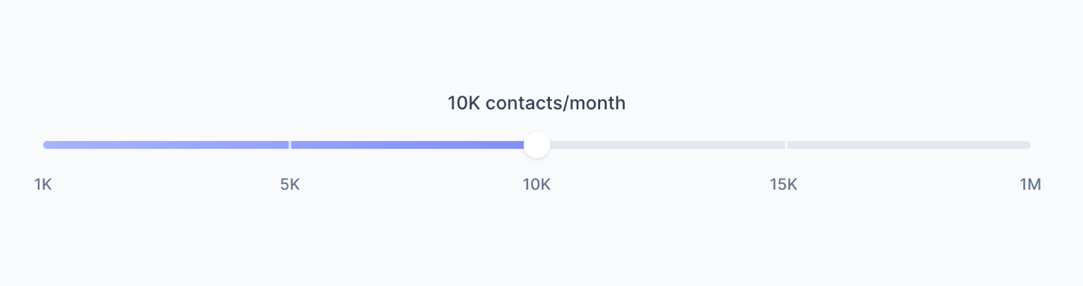
<div class="text-center text-sm text-slate-700 font-medium">10K contacts/month</div>
<div class="relative flex items-center">
<input type="range" min="0" max="4" aria-valuetext="10K contacts/month" aria-label="Pricing Slider">
</div>
</div>Currently, the slider doesn’t have any styles. It looks differently in various browsers as it is a native HTML element. The purpose of this tutorial is to give the slider a custom and consistent style across all browsers.
Styling the slider thumb
Before continuing, let’s carefully examine the slider design and strategize our approach:
The slider thumb is essentially a white circle with a subtle shadow, measuring 20×20 pixels. We’ll apply the appropriate style to the pseudo-element that represents it – ::-webkit-slider-thumb in Webkit-based browsers (Chrome, Safari, Edge, etc.) and ::-moz-range-thumb in Firefox. Let’s outline the Tailwind classes to be added to the input element:
<div class="max-w-sm mx-auto lg:max-w-3xl space-y-3 mb-12 lg:mb-16">
    <div class="text-center text-sm text-slate-700 font-medium">10K contacts/month</div>
    <div class="relative flex items-center">
        <input class="
            relative appearance-none cursor-pointer w-full bg-transparent focus:outline-none
            [&::-webkit-slider-thumb]:appearance-none
            [&::-webkit-slider-thumb]:h-5
            [&::-webkit-slider-thumb]:w-5
            [&::-webkit-slider-thumb]:rounded-full
            [&::-webkit-slider-thumb]:bg-white
            [&::-webkit-slider-thumb]:shadow
            [&::-webkit-slider-thumb]:focus-visible:ring
            [&::-webkit-slider-thumb]:focus-visible:ring-indigo-300
            [&::-moz-range-thumb]:h-5
            [&::-moz-range-thumb]:w-5
            [&::-moz-range-thumb]:rounded-full
            [&::-moz-range-thumb]:bg-white
            [&::-moz-range-thumb]:border-none
            [&::-moz-range-thumb]:shadow
            [&::-moz-range-thumb]:focus-visible:ring
            [&::-moz-range-thumb]:focus-visible:ring-indigo-300
        " type="range" min="0" max="4" aria-valuetext="10K contacts/month" aria-label="Pricing Slider">
    </div>
</div>
For those who prefer the traditional “semantic CSS” approach, the code may seem somewhat extensive at this point. This is a consequence of employing utility classes. If the multitude of classes within a single element feels overwhelming, you can always create a custom class and apply it to the input element.
Note that we’ve also already styled the focus. So, when you use the Tab key, you can easily navigate to the slider and adjust the value using the right and left arrows. When the element is in focus, you’ll see a nice indigo-colored focus ring that matches the slider’s background color.
Styling the slider track
Let’s go back to our original design and focus on the slider track now: it’s a horizontal bar with rounded edges, measuring 6 pixels in height and having a very light gray color. There are two main complexities with this element:
- The area to the left of the thumb is a linear gradient, starting with a light indigo and ending with a slightly darker indigo.
- The entire track is marked with a tick at each step.
It’s a real CSS challenge. We cannot use the pseudo-elements ::-webkit-slider-runnable-track and ::-moz-range-track because a single element doesn’t allow us to incorporate all the details from the design.
So, let’s make native track transparent and add a new HTML element as a replacement:
<div class="max-w-sm mx-auto lg:max-w-3xl space-y-3 mb-12 lg:mb-16">
    <div class="text-center text-sm text-slate-700 font-medium">10K contacts/month</div>
    <div class="relative flex items-center">
        <div class="
            absolute left-2.5 right-2.5 h-1.5 bg-slate-200 rounded-full overflow-hidden
        " aria-hidden="true"></div>
        <input class="
            relative appearance-none cursor-pointer w-full bg-transparent focus:outline-none
            [&::-webkit-slider-thumb]:appearance-none
            [&::-webkit-slider-thumb]:h-5
            [&::-webkit-slider-thumb]:w-5
            [&::-webkit-slider-thumb]:rounded-full
            [&::-webkit-slider-thumb]:bg-white
            [&::-webkit-slider-thumb]:shadow
            [&::-webkit-slider-thumb]:focus-visible:ring
            [&::-webkit-slider-thumb]:focus-visible:ring-indigo-300
            [&::-moz-range-thumb]:h-5
            [&::-moz-range-thumb]:w-5
            [&::-moz-range-thumb]:rounded-full
            [&::-moz-range-thumb]:bg-white
            [&::-moz-range-thumb]:border-none
            [&::-moz-range-thumb]:shadow
            [&::-moz-range-thumb]:focus-visible:ring
            [&::-moz-range-thumb]:focus-visible:ring-indigo-300
        " type="range" min="0" max="4" aria-valuetext="10K contacts/month" aria-label="Pricing Slider">
    </div>
</div>
As you can see, we’ve added a <div< with the aria-hidden="true" attribute that hides it to screen readers.
Next, we’ll use the ::before pseudo-element to create the linear gradient and the ::after pseudo-element for the ticks. Let’s start with the linear gradient:
<div class="
    absolute left-2.5 right-2.5 h-1.5 bg-slate-200 rounded-full overflow-hidden
    before:absolute
    before:inset-0
    before:bg-gradient-to-r
    before:from-indigo-300
    before:to-indigo-500
    before:[mask-image:_linear-gradient(to_right,theme(colors.white),theme(colors.white)_50%,transparent_50%)]
" aria-hidden="true"></div>
The fill bar spans the entire bar and is perfectly clipped in half using a mask – we’ll see how to dinalically adjust the mask position based on the slider value later.
Now, let’s use the ::after pseudo-element to show the ticks:
<div class="
    absolute left-2.5 right-2.5 h-1.5 bg-slate-200 rounded-full overflow-hidden
    before:absolute
    before:inset-0
    before:bg-gradient-to-r
    before:from-indigo-300
    before:to-indigo-500
    before:[mask-image:_linear-gradient(to_right,theme(colors.white),theme(colors.white)_50%,transparent_50%)]
    after:absolute
    after:inset-0
    after:bg-[repeating-linear-gradient(to_right,transparent,transparent_calc(25%-1px),theme(colors.white/.7)_calc(25%-1px),theme(colors.white/.7)_calc(25%+1px))]
" aria-hidden="true"></div>
We are using a repeating linear gradient for the ticks. The slider steps are 5, so the bar consists of 4 segments, each occupying 25% of the total length.
To create the repeating gradient pattern for the ticks with a total width of 2 pixels, we’ll follow this approach:
- From
0%to25% - 1, the color remains transparent. - From
25% - 1to25% + 1, the color is white with 70% opacity.
This way, we’ll have 3 ticks at 25%, 50%, and 75% of the bar’s length. Cool, isn’t it?
As obvious, the value 25% works as long as we have a range of 5 steps. We’ll see later how to make this value dynamic.
Adding Alpine.js logic
So far, we’ve styled out range slider. Now, let’s add Alpine.js to add interactivity. First, include the library in the document head:
<script defer src="https://cdn.jsdelivr.net/npm/[email protected]/dist/cdn.min.js"></script>The next step is to add an x-data attribute to the element that contains both the range input and the pricing tables:
<div x-data="pricingSlider">

    <!-- Pricing slider -->
    <div class="max-w-sm mx-auto lg:max-w-3xl space-y-3 mb-12 lg:mb-16">
        <div class="text-center text-sm text-slate-700 font-medium">10K contacts/month</div>
            ...
Now, immediately after the x-data="pricingSlider"> element, we’ll add a <script> tag containing the JavaScript object with the logic:
<script>
    document.addEventListener('alpine:init', () => {
        Alpine.data('pricingSlider', () => ({
            value: 2,
            prices: [
                {
                    contacts: '1K',
                    plans: {
                        starter: '5',
                        business: '9',
                    }
                },
                {
                    contacts: '5K',
                    plans: {
                        starter: '19',
                        business: '29',
                    }
                },
                {
                    contacts: '10K',
                    plans: {
                        starter: '29',
                        business: '49',
                    }
                },
                {
                    contacts: '15K',
                    plans: {
                        starter: '39',
                        business: '59',
                    }
                },
                {
                    contacts: '1M',
                    plans: {
                        starter: '1,490',
                        business: '2,490',
                    }
                },
            ],
            segmentsWidth: '100%',
            progress: '0%',
            segments: 1,
            calculateProgress() {
                this.segmentsWidth = 100 / this.segments + '%'
                this.progress = 100 / this.segments * this.value + '%'
            },
            init() {
                this.segments = this.prices.length - 1
                this.calculateProgress()
                this.$watch('value', () => this.calculateProgress())
            },
        }))
    })
</script>
A few things are going on in this code, so let’s break it down:
- The
valueproperty represents the current slider value, initialized to 2. - The
pricesproperty contains an array of objects, each representing a segment of the slider, with corresponding contact numbers and prices for “Starter” and “Business” plans. - The
segmentsWidthproperty denotes the width of each slider, initialized to 100%. - The
progressproperty represents the width of the fill bar, initialized to 0%. - The
calculateProgress()method calculates the width of each segment (segmentsWidth) and the width of the fill bar (progress). - The
init()method, executed at startup, invokes thecalculateProgress()method. Additionally, it adds a watcher to thevalueproperty so that every time the slider value changes, thecalculateProgress()method is called again.
Completing the slider functionality
Now we have everything we need to make the slider functional. Let’s bind the slider value:
<input class="
    relative appearance-none cursor-pointer w-full bg-transparent focus:outline-none
    [&::-webkit-slider-thumb]:appearance-none
    [&::-webkit-slider-thumb]:h-5
    [&::-webkit-slider-thumb]:w-5
    [&::-webkit-slider-thumb]:rounded-full
    [&::-webkit-slider-thumb]:bg-white
    [&::-webkit-slider-thumb]:shadow
    [&::-webkit-slider-thumb]:focus-visible:ring
    [&::-webkit-slider-thumb]:focus-visible:ring-indigo-300
    [&::-moz-range-thumb]:h-5
    [&::-moz-range-thumb]:w-5
    [&::-moz-range-thumb]:rounded-full
    [&::-moz-range-thumb]:bg-white
    [&::-moz-range-thumb]:border-none
    [&::-moz-range-thumb]:shadow
    [&::-moz-range-thumb]:focus-visible:ring
    [&::-moz-range-thumb]:focus-visible:ring-indigo-300
" type="range" min="0" :max="prices.length - 1" :aria-valuetext="`${prices[value].contacts} contacts/month`" aria-label="Pricing Slider" x-model="value">
Using the x-model directive, we’ve bound the slider value to the value property of the JavaScript object. This way, we can update the value property every time the slider is moved.
Additionally, we’ve used :max to dynamically set the maximum value of the slider to prices.length - 1.
Finally, we’ve used the :aria-valuetext directive to update the value of the aria-valuetext attribute every time the slider is moved. This way, the screen reader will read the the right number of contacts. Similarly, the paragraph above the slider will reflect the current value:
<div class="text-center text-sm text-slate-700 font-medium" x-text="`${prices[value].contacts} contacts/month`"></div>Next, to display the correct number of ticks and adjust the fill bar during slider interaction, we need to bring the values of the segmentsWidth and progress properties into the HTML as CSS variables. To do this, we’ll use the :style directive:
<div class="max-w-sm mx-auto lg:max-w-3xl space-y-3 mb-12 lg:mb-16">
    <div class="text-center text-sm text-slate-700 font-medium" x-text="`${prices[value].contacts} contacts/month`"></div>
    <div class="relative flex items-center" :style="`--progress:${progress};--segments-width:${segmentsWidth}`">
        ...
Now that we have set these two CSS variables, we can replace the hardcoded values in the previously defined custom classes:
<div class="
    absolute left-2.5 right-2.5 h-1.5 bg-slate-200 rounded-full overflow-hidden
    before:absolute
    before:inset-0
    before:bg-gradient-to-r
    before:from-indigo-300
    before:to-indigo-500
    before:[mask-image:_linear-gradient(to_right,theme(colors.white),theme(colors.white)_var(--progress),transparent_var(--progress))]
    after:absolute
    after:inset-0
    after:bg-[repeating-linear-gradient(to_right,transparent,transparent_calc(var(--segments-width)-1px),theme(colors.white/.7)_calc(var(--segments-width)-1px),theme(colors.white/.7)_calc(var(--segments-width)+1px))]
    [&[x-cloak]]:hidden
" aria-hidden="true" x-cloak></div>
Finally, to complete the design, we need to show the value of each tick below the slider. To do this, we’ll use a <ul> element and populate it with an x-for loop:
       ...
        <input class="
            relative appearance-none cursor-pointer w-full bg-transparent focus:outline-none
            [&::-webkit-slider-thumb]:appearance-none
            [&::-webkit-slider-thumb]:h-5
            [&::-webkit-slider-thumb]:w-5
            [&::-webkit-slider-thumb]:rounded-full
            [&::-webkit-slider-thumb]:bg-white
            [&::-webkit-slider-thumb]:shadow
            [&::-webkit-slider-thumb]:focus-visible:ring
            [&::-webkit-slider-thumb]:focus-visible:ring-indigo-300
            [&::-moz-range-thumb]:h-5
            [&::-moz-range-thumb]:w-5
            [&::-moz-range-thumb]:rounded-full
            [&::-moz-range-thumb]:bg-white
            [&::-moz-range-thumb]:border-none
            [&::-moz-range-thumb]:shadow
            [&::-moz-range-thumb]:focus-visible:ring
            [&::-moz-range-thumb]:focus-visible:ring-indigo-300
        " type="range" min="0" :max="prices.length - 1" :aria-valuetext="`${prices[value].contacts} contacts/month`" aria-label="Pricing Slider" x-model="value">
    </div>
    <div>
        <ul class="flex justify-between text-xs font-medium text-slate-500 px-2.5">
            <template x-for="(price, index) in prices" :key="index">
                <li class="relative"><span class="absolute -translate-x-1/2" x-text="price.contacts"></span></li>
            </template>
        </ul>
    </div>
</div>
Updating prices on slider move
To complete our slider, we just need to update the prices based on the current slider value. All we have to do is add an x-text binding to the pricing tables element. Our component is ready to go! Here’s the final code:
<div x-data="pricingSlider">

    <!-- Pricing slider -->
    <div class="max-w-sm mx-auto lg:max-w-3xl space-y-3 mb-12 lg:mb-16">
        <div class="text-center text-sm text-slate-700 font-medium" x-text="`${prices[value].contacts} contacts/month`"></div>
        <div class="relative flex items-center" :style="`--progress:${progress};--segments-width:${segmentsWidth}`">
            <div class="
                absolute left-2.5 right-2.5 h-1.5 bg-slate-200 rounded-full overflow-hidden
                before:absolute
                before:inset-0
                before:bg-gradient-to-r
                before:from-indigo-300
                before:to-indigo-500
                before:[mask-image:_linear-gradient(to_right,theme(colors.white),theme(colors.white)_var(--progress),transparent_var(--progress))]
                after:absolute
                after:inset-0
                after:bg-[repeating-linear-gradient(to_right,transparent,transparent_calc(var(--segments-width)-1px),theme(colors.white/.7)_calc(var(--segments-width)-1px),theme(colors.white/.7)_calc(var(--segments-width)+1px))]
                [&[x-cloak]]:hidden
            " aria-hidden="true" x-cloak></div>
            <input class="
                relative appearance-none cursor-pointer w-full bg-transparent focus:outline-none
                [&::-webkit-slider-thumb]:appearance-none
                [&::-webkit-slider-thumb]:h-5
                [&::-webkit-slider-thumb]:w-5
                [&::-webkit-slider-thumb]:rounded-full
                [&::-webkit-slider-thumb]:bg-white
                [&::-webkit-slider-thumb]:shadow
                [&::-webkit-slider-thumb]:focus-visible:ring
                [&::-webkit-slider-thumb]:focus-visible:ring-indigo-300
                [&::-moz-range-thumb]:h-5
                [&::-moz-range-thumb]:w-5
                [&::-moz-range-thumb]:rounded-full
                [&::-moz-range-thumb]:bg-white
                [&::-moz-range-thumb]:border-none
                [&::-moz-range-thumb]:shadow
                [&::-moz-range-thumb]:focus-visible:ring
                [&::-moz-range-thumb]:focus-visible:ring-indigo-300
            " type="range" min="0" :max="prices.length - 1" :aria-valuetext="`${prices[value].contacts} contacts/month`" aria-label="Pricing Slider" x-model="value">
        </div>
        <div>
            <ul class="flex justify-between text-xs font-medium text-slate-500 px-2.5">
                <template x-for="(price, index) in prices" :key="index">
                    <li class="relative"><span class="absolute -translate-x-1/2" x-text="price.contacts"></span></li>
                </template>
            </ul>
        </div>
    </div>

    <div class="max-w-sm mx-auto grid gap-6 lg:grid-cols-2 items-start lg:max-w-[728px]">

        <!-- Pricing tab 1 -->
        <div class="h-full">
            <div class="relative flex flex-col h-full p-6 pb-10">
                <div class="h-8" aria-hidden="true"></div>
                <div class="mb-5">
                    <div class="text-slate-900 font-semibold mb-1">Starter</div>
                    <div class="inline-flex items-baseline mb-2">
                        <span class="text-slate-900 font-bold text-3xl">$</span>
                        <span class="text-slate-900 font-bold text-4xl" x-text="prices[value].plans.starter"></span>
                        <span class="text-slate-500 font-medium">/mo</span>
                    </div>
                    <div class="text-sm text-slate-500 mb-5">There are many variations available, but the majority have suffered.</div>
                    <a class="w-full inline-flex justify-center whitespace-nowrap rounded-lg bg-indigo-500 px-3.5 py-2.5 text-sm font-medium text-white shadow-sm shadow-indigo-950/10 hover:bg-indigo-600 focus-visible:outline-none focus-visible:ring focus-visible:ring-indigo-300 transition-colors duration-150" href="#0">
                        Purchase Plan
                    </a>
                </div>
                <div class="text-slate-900 text-sm font-medium mb-4">Includes:</div>
                <ul class="text-slate-600 text-sm space-y-3 grow">
                    <li class="flex items-center">
                        <svg class="w-3 h-3 fill-emerald-500 mr-3 shrink-0" viewBox="0 0 12 12" xmlns="http://www.w3.org/2000/svg">
                            <path d="M10.28 2.28L3.989 8.575 1.695 6.28A1 1 0 00.28 7.695l3 3a1 1 0 001.414 0l7-7A1 1 0 0010.28 2.28z" />
                        </svg>
                        <span>Unlimited placeholder texts</span>
                    </li>
                    <li class="flex items-center">
                        <svg class="w-3 h-3 fill-emerald-500 mr-3 shrink-0" viewBox="0 0 12 12" xmlns="http://www.w3.org/2000/svg">
                            <path d="M10.28 2.28L3.989 8.575 1.695 6.28A1 1 0 00.28 7.695l3 3a1 1 0 001.414 0l7-7A1 1 0 0010.28 2.28z" />
                        </svg>
                        <span>Consectetur adipiscing elit</span>
                    </li>
                    <li class="flex items-center">
                        <svg class="w-3 h-3 fill-emerald-500 mr-3 shrink-0" viewBox="0 0 12 12" xmlns="http://www.w3.org/2000/svg">
                            <path d="M10.28 2.28L3.989 8.575 1.695 6.28A1 1 0 00.28 7.695l3 3a1 1 0 001.414 0l7-7A1 1 0 0010.28 2.28z" />
                        </svg>
                        <span>Excepteur sint occaecat cupidatat</span>
                    </li>
                    <li class="flex items-center">
                        <svg class="w-3 h-3 fill-emerald-500 mr-3 shrink-0" viewBox="0 0 12 12" xmlns="http://www.w3.org/2000/svg">
                            <path d="M10.28 2.28L3.989 8.575 1.695 6.28A1 1 0 00.28 7.695l3 3a1 1 0 001.414 0l7-7A1 1 0 0010.28 2.28z" />
                        </svg>
                        <span>Officia deserunt mollit anim</span>
                    </li>
                </ul>
            </div>
        </div>

        <!-- Pricing tab 2 -->
        <div class="h-full">
            <div class="relative flex flex-col h-full p-6 pb-10 rounded-2xl bg-slate-900 border border-slate-900 shadow shadow-slate-950/5">
                <div class="absolute top-0 right-0 mr-6 -mt-4">
                    <div class="inline-flex items-center text-xs font-semibold py-1.5 px-3 bg-emerald-500 text-white rounded-full shadow-sm shadow-slate-950/5">Most Popular</div>
                </div>
                <div class="h-8" aria-hidden="true">
                    <svg class="drop-shadow-[0_0_8px_rgba(224,154,19,0.7)]" xmlns="http://www.w3.org/2000/svg" width="24" height="26">
                        <defs>
                            <linearGradient id="a" x1="50%" x2="50%" y1="0%" y2="100%">
                                <stop offset="0%" stop-color="#FBBF24" />
                                <stop offset="100%" stop-color="#F59E0B" />
                            </linearGradient>
                        </defs>
                        <path fill="url(#a)" fill-rule="evenodd" d="M15 0 0 16h11L9 26l15-16H13z" />
                    </svg>
                </div>
                <div class="mb-5">
                    <div class="text-slate-200 font-semibold mb-1">Business</div>
                    <div class="inline-flex items-baseline mb-2">
                        <span class="text-slate-200 font-bold text-3xl">$</span>
                        <span class="text-slate-200 font-bold text-4xl" x-text="prices[value].plans.business"></span>
                        <span class="text-slate-500 font-medium">/mo</span>
                    </div>
                    <div class="text-sm text-slate-500 mb-5">There are many variations available, but the majority have suffered.</div>
                    <a class="w-full inline-flex justify-center whitespace-nowrap rounded-lg bg-indigo-500 px-3.5 py-2.5 text-sm font-medium text-white shadow-sm shadow-indigo-950/10 hover:bg-indigo-600 focus-visible:outline-none focus-visible:ring focus-visible:ring-slate-600 transition-colors duration-150" href="#0">
                        Purchase Plan
                    </a>
                </div>
                <div class="text-slate-200 text-sm font-medium mb-4">Everything in Starter, plus:</div>
                <ul class="text-slate-400 text-sm space-y-3 grow">
                    <li class="flex items-center">
                        <svg class="w-3 h-3 fill-emerald-500 mr-3 shrink-0" viewBox="0 0 12 12" xmlns="http://www.w3.org/2000/svg">
                            <path d="M10.28 2.28L3.989 8.575 1.695 6.28A1 1 0 00.28 7.695l3 3a1 1 0 001.414 0l7-7A1 1 0 0010.28 2.28z" />
                        </svg>
                        <span>Unlimited placeholder texts</span>
                    </li>
                    <li class="flex items-center">
                        <svg class="w-3 h-3 fill-emerald-500 mr-3 shrink-0" viewBox="0 0 12 12" xmlns="http://www.w3.org/2000/svg">
                            <path d="M10.28 2.28L3.989 8.575 1.695 6.28A1 1 0 00.28 7.695l3 3a1 1 0 001.414 0l7-7A1 1 0 0010.28 2.28z" />
                        </svg>
                        <span>Consectetur adipiscing elit</span>
                    </li>
                    <li class="flex items-center">
                        <svg class="w-3 h-3 fill-emerald-500 mr-3 shrink-0" viewBox="0 0 12 12" xmlns="http://www.w3.org/2000/svg">
                            <path d="M10.28 2.28L3.989 8.575 1.695 6.28A1 1 0 00.28 7.695l3 3a1 1 0 001.414 0l7-7A1 1 0 0010.28 2.28z" />
                        </svg>
                        <span>Excepteur sint occaecat cupidatat</span>
                    </li>
                    <li class="flex items-center">
                        <svg class="w-3 h-3 fill-emerald-500 mr-3 shrink-0" viewBox="0 0 12 12" xmlns="http://www.w3.org/2000/svg">
                            <path d="M10.28 2.28L3.989 8.575 1.695 6.28A1 1 0 00.28 7.695l3 3a1 1 0 001.414 0l7-7A1 1 0 0010.28 2.28z" />
                        </svg>
                        <span>Officia deserunt mollit anim</span>
                    </li>
                    <li class="flex items-center">
                        <svg class="w-3 h-3 fill-emerald-500 mr-3 shrink-0" viewBox="0 0 12 12" xmlns="http://www.w3.org/2000/svg">
                            <path d="M10.28 2.28L3.989 8.575 1.695 6.28A1 1 0 00.28 7.695l3 3a1 1 0 001.414 0l7-7A1 1 0 0010.28 2.28z" />
                        </svg>
                        <span>Predefined chunks as necessary</span>
                    </li>
                </ul>
            </div>
        </div>

    </div>

</div>
<!-- Slider data and functionality: https://github.com/alpinejs/alpine -->
<script>
    document.addEventListener('alpine:init', () => {
        Alpine.data('pricingSlider', () => ({
            value: 2,
            prices: [
                {
                    contacts: '1K',
                    plans: {
                        starter: '5',
                        business: '9',
                    }
                },
                {
                    contacts: '5K',
                    plans: {
                        starter: '19',
                        business: '29',
                    }
                },
                {
                    contacts: '10K',
                    plans: {
                        starter: '29',
                        business: '49',
                    }
                },
                {
                    contacts: '15K',
                    plans: {
                        starter: '39',
                        business: '59',
                    }
                },
                {
                    contacts: '1M',
                    plans: {
                        starter: '1,490',
                        business: '2,490',
                    }
                },
            ],
            segmentsWidth: '100%',
            progress: '0%',
            segments: 1,
            calculateProgress() {
                this.segmentsWidth = 100 / this.segments + '%'
                this.progress = 100 / this.segments * this.value + '%'
            },
            init() {
                this.segments = this.prices.length - 1
                this.calculateProgress()
                this.$watch('value', () => this.calculateProgress())
            },
        }))
    })
</script>
Conclusions
The component we’ve just created has a simple yet effective logic and, as you’ve seen, it performs really well. It’s easy to customize and is designed to automatically adapt to a different number of steps. You can easily define your price tiers by adding or removing elements from the prices array.
If you’re wondering how to create a similar component with Next.js or Vue, we recommend taking a look at Gray – our Tailwind template specifically designed for startup landing pages.