The .button class is required to apply a very basic button style, and it can be used on:
<button>elements<a>anchor tags<input>elements that are meant to look like buttons (e.g.<input type="submit">)
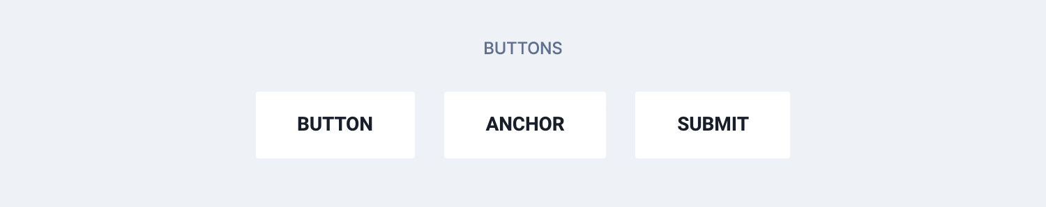
<button class="button">Button</button>
<a class="button" href="#">Anchor</a>
<input class="button" type="submit" value="Submit">
For React and Vue templates we have provided a button component that can be used as shown in the example below.
The button component returns a <button> element by default. You need to set a tag prop in order to output an anchor link (tag="a") or an input (tag="input").
<Button>Button</Button>
<Button tag="a" href="#">Anchor</Button>
<Button tag="input" type="submit" value="Submit" />
<c-button>Button</c-button>
<c-button tag="a" href="#">Anchor</c-button>
<c-button tag="input" type="submit" value="Submit" />Colors
Each template comes with buttons in 4 different colors, inherited from the color palette.
By default, a button has a white background color unless you add a specific modifier class to change that.
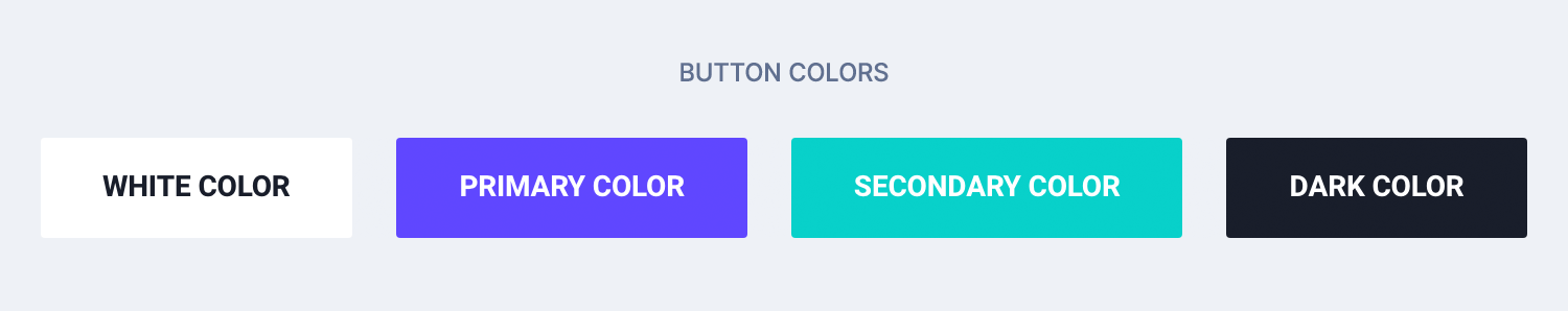
<button class="button">White color</button>
<button class="button button-primary">Primary color</button>
<button class="button button-secondary">Secondary color</button>
<button class="button button-dark">Dark color</button>
In React and Vue you can use the color prop instead 👇
<Button>White color</Button>
<Button color="primary">Primary color</Button>
<Button color="secondary">Secondary color</Button>
<Button color="dark">Dark color</Button>
<c-button>White color</c-button>
<c-button color="primary">Primary color</c-button>
<c-button color="secondary">Secondary color</c-button>
<c-button color="dark">Dark color</c-button>Sizes
Buttons come in 2 sizes. Add a .button-sm class to make a button look smaller.
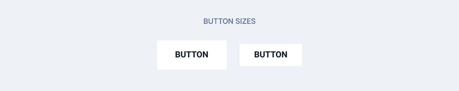
<button class="button">Button</button>
<button class="button button-sm">Button</button>
Use the size prop in React and Vue 👇
<Button>Button</Button>
<Button size="sm">Button</Button>
<c-button>Button</c-button>
<c-button size="sm">Button</c-button>Loading state
When waiting for a response from the server (for example, right after sending an AJAX request), you might want to hide the button inner text and display a spinner.
It can be displayed by adding the .is-loading class. The button will keep its original size and you don’t need to hide or remove the inner text.

<button class="button is-loading">Click me!</button>In React and Vue you can use the boolean loading prop.
<Button loading>Click me!</Button><c-button loading>Click me!</c-button>Disabled state
To prevent users from interacting with a button, just use the disabled HTML attribute.
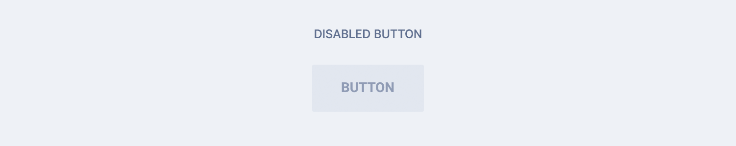
<button class="button" disabled>Button</button>In React and Vue you can use the boolean loading prop.
<Button disabled>Button</Button><c-button disabled>Button</c-button>Other modifiers
.button-blockmakes a button fit the width of its container.button-wide-mobilecan be used to make a button look larger on smaller screens
<button class="button button-block">Full width button</button>
<button class="button button-wide-mobile">Wider on mobile</button>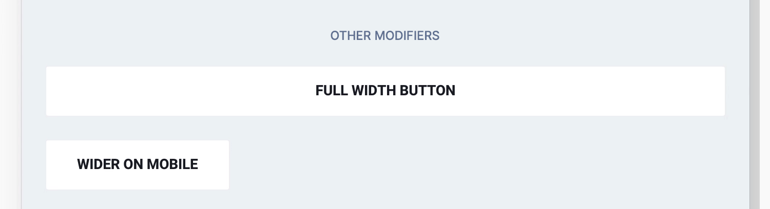
And, as you can guess… 👇
<Button wide>Full width button</Button>
<Button wideMobile>A little wider on mobile</Button>
<c-button wide>Full width button</c-button>
<c-button wide-mobile>A little wider on mobile</c-button>Button group
If you wish to group buttons on a single line, wrap them in a tag with a .button-group class. You won’t need to worry about spacing between buttons.
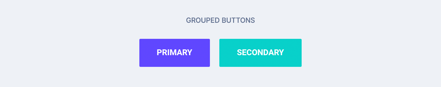
<div class="button-group">
    <button class="button button-primary">Primary</button>
    <button class="button button-secondary">Secondary</button>
</div>
We have included a React and Vue component for such a wrapper as well 👇
<ButtonGroup>
  <Button color="primary">Primary</Button>
  <Button color="secondary">Secondary</Button>
</ButtonGroup>
<c-button-group>
<c-button color="primary">Primary</c-button>
<c-button color="secondary">Secondary</c-button>
</c-button-group><div class="button-group"></div> wrapper for multiple buttons.Button link
This is more a helper class than a button, and it can be helpful if you want to display a link for a secondary action right after a button. Add the .button-link class to the link and wrap both elements in a .button-group like this 👇
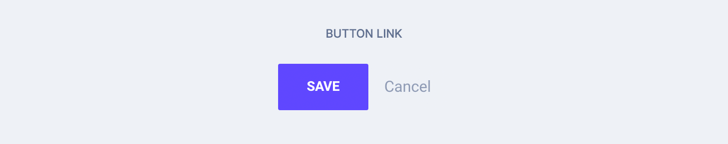
<div class="button-group">
    <button class="button button-primary">Save</button>
    <a class="button-link text-xs">Cancel</a>
</div>.text-xs helper class to make the link a little smaller. Go to the Helper classes chapter to learn more.TL;DR
List of available HTML classes
| Class | Description |
|---|---|
.button | Required to make an element look like a button |
.button-primary .button-secondary .button-dark | To set the background color different than the default white |
.button-sm | To make a button smaller |
.is-loading | To display a loading spinner in place of text |
.button-block | To make a button full-width |
.button-wide-mobile | To make a button a little wider on mobile only |
.button-link | Helper class to be used for secondary action right after a button. Use it without the .button class. |
React props
| Prop | Type | Default | Accepted values |
|---|---|---|---|
tag | string | button | button, a, input |
color | string | – | primary, secondary, dark |
size | string | – | sm |
loading | boolean | false | – |
disabled | boolean | false | – |
wide | boolean | false | – |
wideMobile | boolean | false | – |
Vue props
| Prop | Type | Default | Accepted values |
|---|---|---|---|
tag | string | button | button, a, input |
color | string | – | primary, secondary, dark |
size | string | – | sm |
loading | boolean | false | – |
disabled | boolean | false | – |
wide | boolean | false | – |
wide-mobile | boolean | false | – |
Theming
Style is defined into 3 files:
📋 Core file
src/assets/scss/core/elements/_buttons.scss
👆🚫 Don’t edit this file!
📋 Settings file
src/assets/scss/settings/elements/_buttons-and-forms.scss
👆 Use this to adjust Sass variables
📋 Theme file
src/assets/scss/theme/elements/_buttons.scss
👆 Use this to add custom CSS