Effective on March 1st, 2023, Cruip CSS templates are no longer distributed, maintained or supported.
Checkbox buttons have to be wrapped in a <label> with a .form-checkbox class 👇
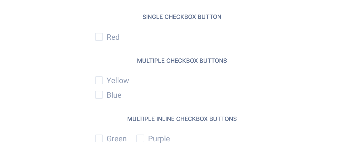
<!-- Single checkbox button -->
<label class="form-checkbox">
    <input type="checkbox" name="red">Red
</label>

<!-- Multiple checkbox buttons -->
<div>
    <label class="form-checkbox">
        <input type="checkbox" name="yellow">Yellow
    </label>
</div>
<div>
    <label class="form-checkbox">
        <input type="checkbox" name="blue">Blue
    </label>
</div>

<!-- Multiple inline checkbox buttons -->
<span>
    <label class="form-checkbox">
        <input type="checkbox" name="green">Green
    </label>
</span>
<span class="ml-16">
    <label class="form-checkbox">
        <input type="checkbox" name="purple">Purple
    </label>
</span>
For React and Vue templates we have provided a checkbox component to be used as in the example below.
<!--Single checkbox button -->
<Checkbox name="red">Red</Checkbox>

<!-- Multiple checkbox buttons -->
<div>
  <Checkbox name="yellow">Yellow</Checkbox>
</div>
<div>
  <Checkbox name="blue">Blue</Checkbox>
</div>

<!-- Multiple inline checkbox buttons -->
<span>
  <Checkbox name="green">Green</Checkbox>
</span>
<span className="ml-16">
  <Checkbox name="purple">Purple</Checkbox>
</span>
<!--Single checkbox button -->
<c-checkbox name="red">Red</c-checkbox>
<!-- Multiple checkbox buttons -->
<div>
<c-checkbox name="yellow">Yellow</c-checkbox>
</div>
<div>
<c-checkbox name="blue">Blue</c-checkbox>
</div>
<!-- Multiple inline checkbox buttons-->
<span>
<c-checkbox name="green">Green</c-checkbox>
</span>
<span className="ml-16">
<c-checkbox name="purple">Purple</c-checkbox>
</span>TL;DR
List of available HTML classes
| Class | Description |
|---|---|
.form-checkbox | Required to make a checkbox fit the template style |
React props
| Prop | Type | Default | Accepted values |
|---|---|---|---|
name | string | – | – |
value | string | – | – |
disabled | boolean | false | – |
checked | boolean | false | – |
required | boolean | false | – |
Vue props
| Prop | Type | Default | Accepted values |
|---|---|---|---|
name | string | – | – |
value | string | – | – |
disabled | boolean | false | – |
checked | boolean | false | – |
required | boolean | false | – |
Theming
Style is defined into 3 files:
📋 Core file
src/assets/scss/core/elements/_forms.scss
👆🚫 Don’t edit this file!
📋 Settings file
src/assets/scss/settings/elements/_buttons-and-forms.scss
👆 Use this to adjust Sass variables
📋 Theme file
src/assets/scss/theme/elements/_forms.scss
👆 Use this to add custom CSS
Learn more about the Sass logic behind each template.