Effective on March 1st, 2023, Cruip CSS templates are no longer distributed, maintained or supported.
Here is an example of a full form that you can use to get started 👇
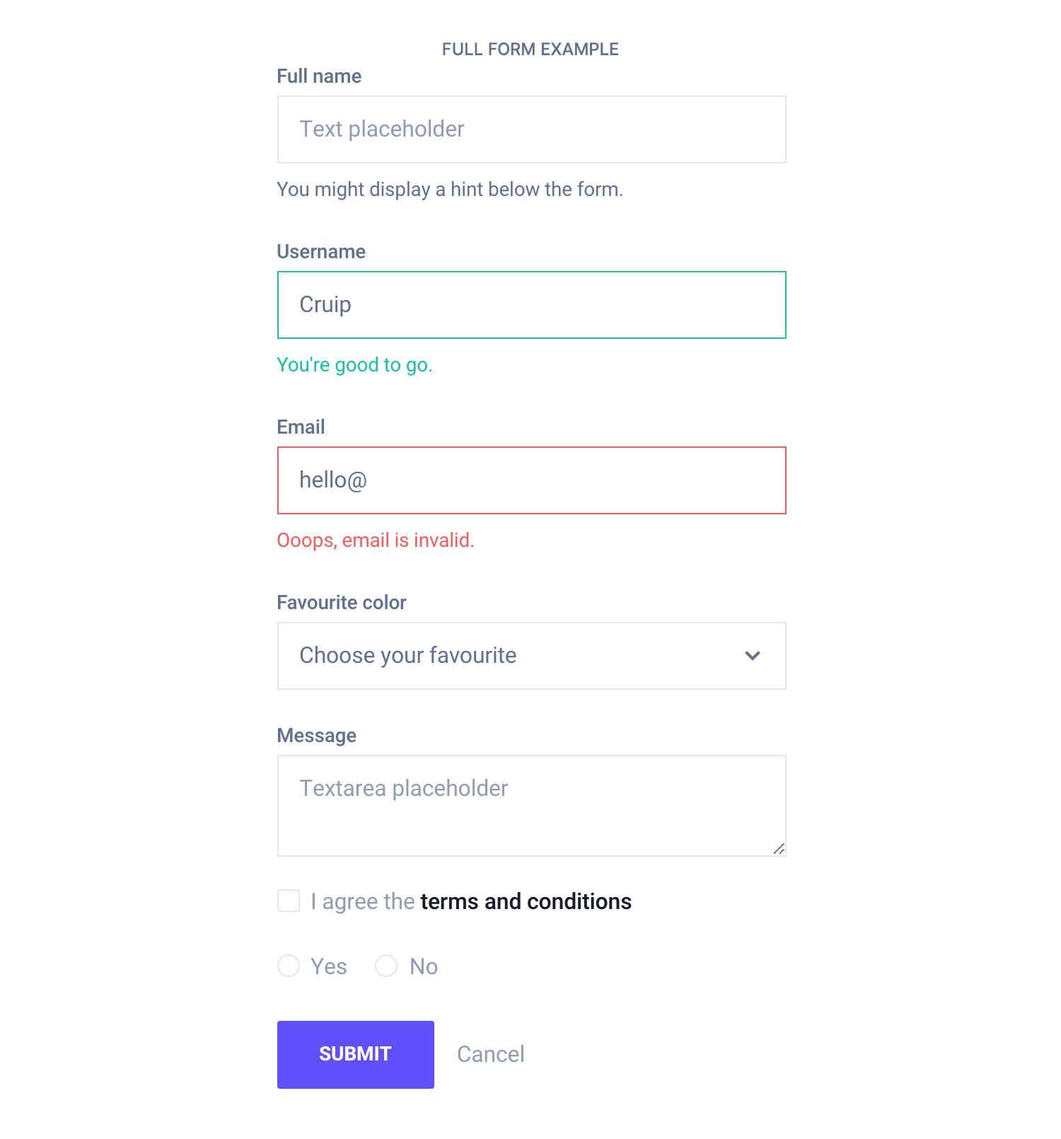
<form>
    <fieldset>
        <div class="mb-16">
            <label class="form-label" for="form-name">Full name</label>
            <input id="form-name" class="form-input" type="text" placeholder="Text placeholder" required>
            <div class="form-hint">You might display a hint below the form.</div>
        </div>
        <div class="mb-16">
            <label class="form-label" for="form-username">Username</label>
            <input id="form-username" class="form-input form-success" type="text" placeholder="Username" value="Cruip" required>
            <div class="form-hint text-color-success">You're good to go.</div>
        </div>
        <div class="mb-16">
            <label class="form-label" for="form-email">Email</label>
            <input id="form-email" class="form-input form-error" type="email" placeholder="Email" value="hello@" required>
            <div class="form-hint text-color-error">Ooops, email is invalid.</div>
        </div>
        <div class="mb-16">
            <label class="form-label" for="form-color">Favourite color</label>
            <select id="form-color" class="form-select">
                <option hidden>Choose your favourite</option>
                <option>Red</option>
                <option>Yellow</option>
                <option>Blue</option>
            </select>
        </div>
        <div class="mb-16">
            <label class="form-label" for="form-message">Message</label>
            <textarea id="form-message" class="form-input" placeholder="Textarea placeholder"></textarea>
        </div>
        <div class="mb-16">
            <label class="form-checkbox">
                <input type="checkbox">I agree the <a href="#">terms and conditions</a>
            </label>
        </div>
        <div class="mb-16">
            <span>
                <label class="form-radio">
                    <input type="radio" name="form-radio">Yes
                </label>
            </span>
            <span class="ml-16">
                <label class="form-radio">
                    <input type="radio" name="form-radio">No
                </label>
            </span>
        </div>
        <div class="mt-24">
            <div class="button-group">
                <button class="button button-primary">Submit</button>
                <a class="button-link text-xs">Cancel</a>
            </div>
        </div>
    </fieldset>
</form>
In React and Vue, ensure to import all required components first.
<form>
  <fieldset>
    <div className="mb-16">
      <Input
        type="text"
        placeholder="Text placeholder"
        label="Full name"
        hint="You might display a hint below the form." />
    </div>
    <div className="mb-16">
      <Input
        type="text"
        placeholder="Username"
        value="Cruip"
        label="Username"
        status="success"
        hint="You're good to go."
        required />
    </div>
    <div className="mb-16">
      <Input
        type="email"
        placeholder="Email"
        value="hello@"
        label="Email"
        status="error"
        hint="Ooops, email is invalid."
        required />
    </div>
    <div className="mb-16">
      <Select label="Favourite color">
        <option hidden>Choose your favourite</option>
        <option>Red</option>
        <option>Yellow</option>
        <option>Blue</option>
      </Select>
    </div>
    <div className="mb-16">
      <Input
        type="textarea"
        placeholder="Textarea placeholder"
        label="Message" />
    </div>
    <div className="mb-16">
      <Checkbox>I agree the <a href="#">terms and conditions</a></Checkbox>
    </div>
    <div className="mb-16">
      <span>
        <Radio name="form-radio">Yes</Radio>
      </span>
      <span className="ml-16">
        <Radio name="form-radio">No</Radio>
      </span>
    </div>
    <div className="mt-24">
      <div className="button-group">
        <Button color="primary">Submit</Button>
        <a className="button-link text-xs">Cancel</a>
      </div>
    </div>
  </fieldset>
</form>
<form>
<fieldset>
<div class="mb-16">
<c-input
type="text"
placeholder="Text placeholder"
label="Full name"
hint="You might display a hint below the form." />
</div>
<div class="mb-16">
<c-input
type="text"
placeholder="Username"
value="Cruip"
label="Username"
status="success"
hint="You're good to go."
required />
</div>
<div class="mb-16">
<c-input
type="email"
placeholder="Email"
value="hello@"
label="Email"
status="error"
hint="Ooops, email is invalid."
required />
</div>
<div class="mb-16">
<c-select label="Favourite color">
<option hidden>Choose your favourite</option>
<option>Red</option>
<option>Yellow</option>
<option>Blue</option>
</c-select>
</div>
<div class="mb-16">
<c-input
type="textarea"
placeholder="Textarea placeholder"
label="Message" />
</div>
<div class="mb-16">
<c-checkbox>I agree the <a href="#">terms and conditions</a></c-checkbox>
</div>
<div class="mb-16">
<span>
<c-radio name="form-radio">Yes</c-radio>
</span>
<span className="ml-16">
<c-radio name="form-radio">No</c-radio>
</span>
</div>
<div class="mt-24">
<div class="button-group">
<c-button color="primary">Submit</c-button>
<a class="button-link text-xs">Cancel</a>
</div>
</div>
</fieldset>
</form>TL;DR
List of available HTML classes
| Class | Description |
|---|---|
.form-hint | Required to make a hint fit the template style |
React and Vue props
Props for hints are:
hint– Defines the hint content
Check out the input and select props lists to know more.
Theming
Style is defined into 3 files:
📋 Core file
src/assets/scss/core/elements/_forms.scss
👆🚫 Don’t edit this file!
📋 Settings file
src/assets/scss/settings/elements/_buttons-and-forms.scss
👆 Use this to adjust Sass variables
📋 Theme file
src/assets/scss/theme/elements/_forms.scss
👆 Use this to add custom CSS
Learn more about the Sass logic behind each template.