Effective on March 1st, 2023, Cruip CSS templates are no longer distributed, maintained or supported.
A hint can be useful if you need to display help, success or error text right below a form field.
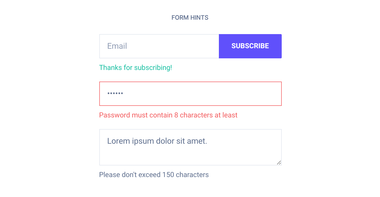
<!-- Success message -->
<div class="form-group">
    <input class="form-input" type="email" placeholder="Email">
    <button class="button button-primary">Subscribe</button>
</div>
<div class="form-hint text-color-success">Thanks for subscribing!</div>

<!-- Error message -->
<input type="password" class="form-input form-error" placeholder="Password" value="123456">
<div class="form-hint text-color-error">Password must contain 8 characters at least</div>

<!-- Help text -->
<textarea class="form-input" placeholder="Tell us about yourself">Lorem ipsum dolor sit amet.</textarea>
<div class="form-hint">Please don't exceed 150 characters</div>
You can assign a different color using the helper classes for text (e.g. .text-color-success, .text-color-error, and more).
For React and Vue templates we have provided a hint component imported by default into the input and select components, and it can be handled via props.
<!-- Success message -->
<Input type="text" placeholder="Email" hint="Thanks for subscribing!" status="success">
  <Button color="primary">Subscribe</Button>
</Input>

<!-- Error message -->
<Input
  type="password"
  placeholder="Password"
  value="123456"
  hint="Password must contain 8 characters at least"
  status="error" />

<!-- Help text -->
<Input
  type="textarea"
  placeholder="Tell us about yourself"
  value="Lorem ipsum dolor sit amet."
  hint="Please don't exceed 150 characters" />
<!-- Success message -->
<c-input type="text" placeholder="Email" hint="Thanks for subscribing!" status="success">
<c-button color="primary">Subscribe</c-button>
</c-input>
<!-- Error message -->
<c-input
type="password"
placeholder="Password"
value="123456"
hint="Password must contain 8 characters at least"
status="error" />
<!-- Help text -->
<c-input
type="textarea"
placeholder="Tell us about yourself"
value="Lorem ipsum dolor sit amet."
hint="Please don't exceed 150 characters" />TL;DR
List of available HTML classes
| Class | Description |
|---|---|
.form-hint | Required to make a hint fit the template style |
React and Vue props
Props for hints are:
hint– Defines the hint content
Check out the input and select props lists to know more.
Theming
Style is defined into 3 files:
📋 Core file
src/assets/scss/core/elements/_forms.scss
👆🚫 Don’t edit this file!
📋 Settings file
src/assets/scss/settings/elements/_buttons-and-forms.scss
👆 Use this to adjust Sass variables
📋 Theme file
src/assets/scss/theme/elements/_forms.scss
👆 Use this to add custom CSS
Learn more about the Sass logic behind each template.