Use the .form-input class on <input> and <textarea> elements to make them fit the template style. Example 👇
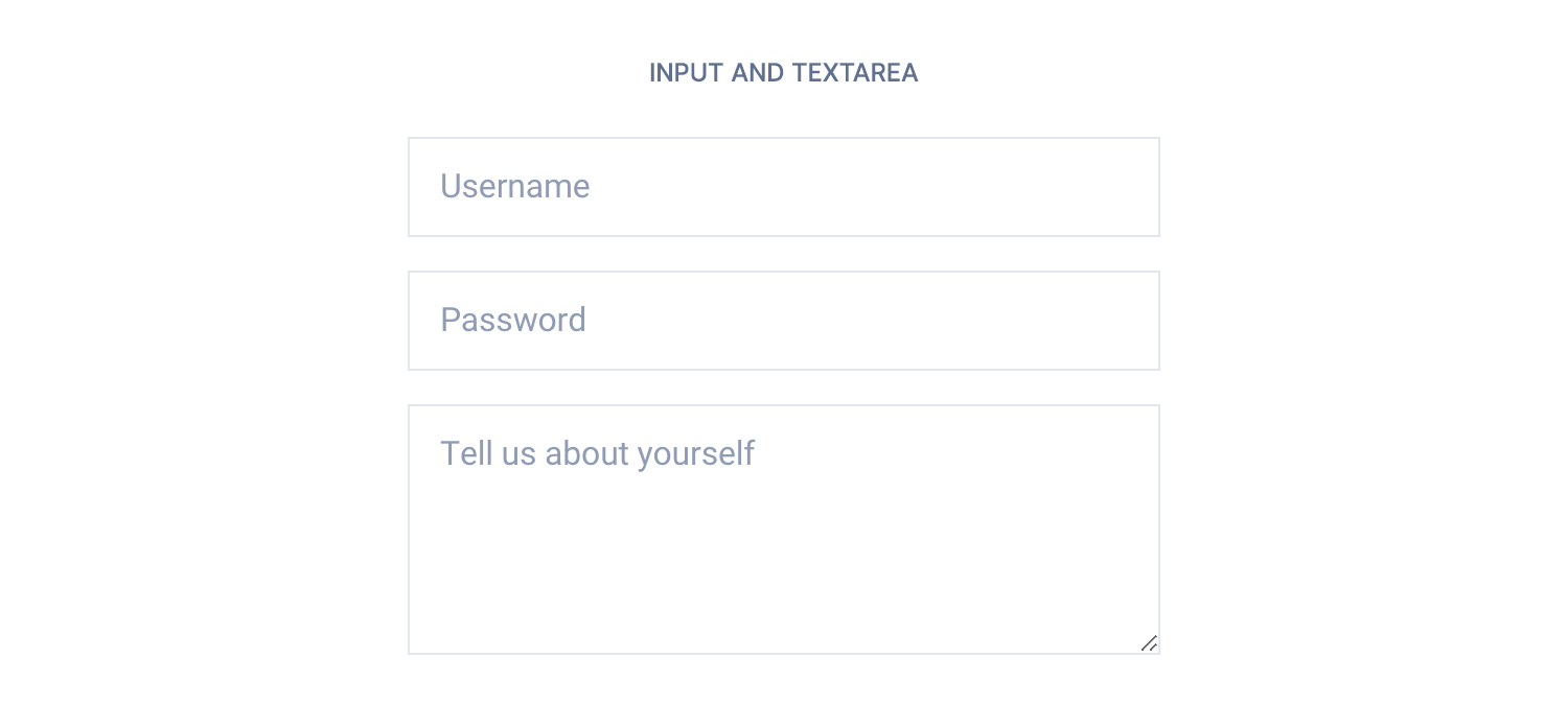
<input type="text" class="form-input" placeholder="Username">
<input type="password" class="form-input" placeholder="Password">
<textarea class="form-input" placeholder="Tell us about yourself" rows="4"></textarea>
In React and Vue templates we have provided an input component that can output input or textarea tags. See the examples below 👇
<Input type="text" placeholder="Username" />
<Input type="password" placeholder="Password" />
<Input type="textarea" placeholder="Tell us about yourself" rows={4} />
<c-input type="text" placeholder="Username" />
<c-input type="password" placeholder="Password" />
<c-input type="textarea" placeholder="Tell us about yourself" :rows="4" />Colors
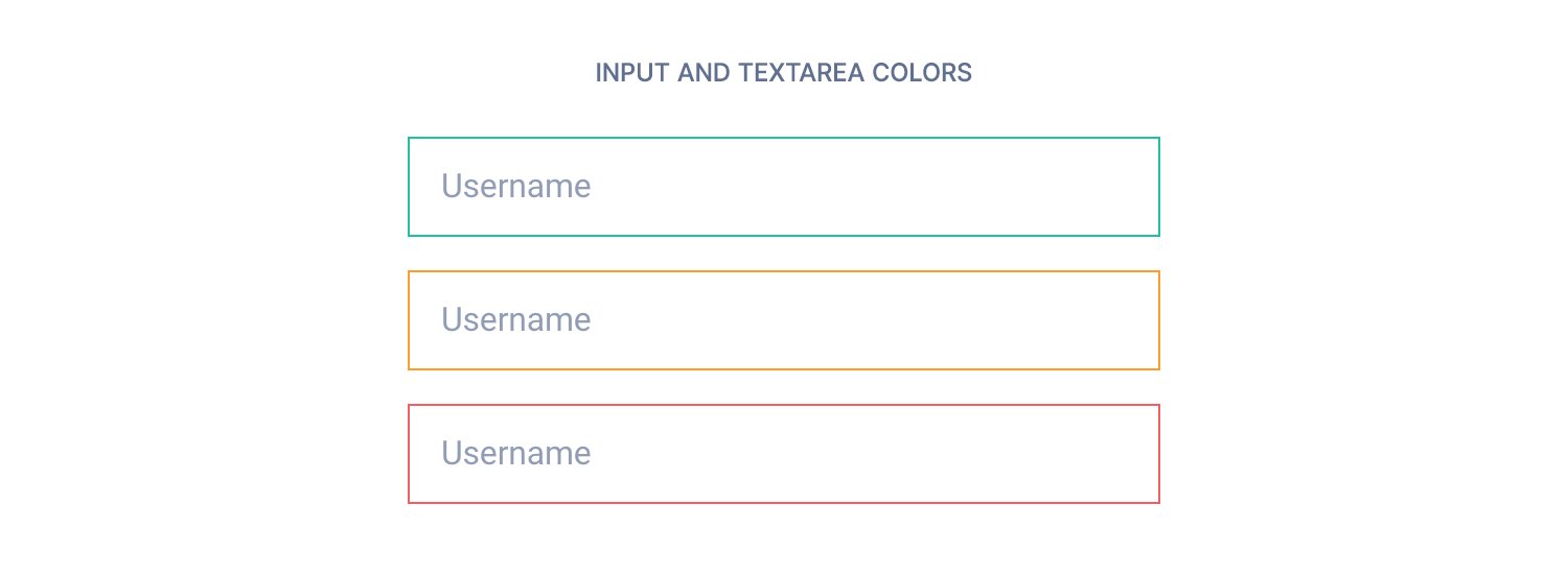
You might want to validate <input>, <textarea> and <select> tags, and make them look different accordingly to their current state.
We have included the following helper classes
.form-success.form-warning.form-error
which produce the output below 👇
<input type="text" class="form-input form-success" placeholder="Username">
<input type="text" class="form-input form-warning" placeholder="Username">
<input type="text" class="form-input form-error" placeholder="Username">
In React and Vue you can use the status prop instead 👇
<Input type="text" status="success" placeholder="Username" />
<Input type="text" status="warning" placeholder="Username" />
<Input type="text" status="error" placeholder="Username" />
<c-input type="text" status="success" placeholder="Username" />
<c-input type="text" status="warning" placeholder="Username" />
<c-input type="text" status="error" placeholder="Username" />Sizes
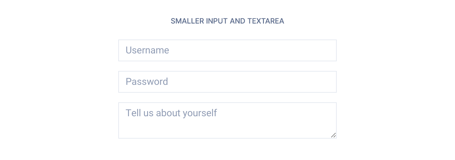
We have included 2 sizesfor input and textarea tags. Add a .form-input-sm class to make them look smaller.
<input type="text" class="form-input form-input-sm" placeholder="Username">
<input type="password" class="form-input form-input-sm" placeholder="Password">
<textarea class="form-input form-input-sm" placeholder="Tell us about yourself"></textarea>
Use the size prop in React and Vue 👇
<Input type="text" size="sm" placeholder="Username" />
<Input type="password" size="sm" placeholder="Password" />
<Input type="textarea" size="sm" placeholder="Tell us about yourself" />
<c-input type="text" size="sm" placeholder="Username" />
<c-input type="password" size="sm" placeholder="Password" />
<c-input type="textarea" size="sm" placeholder="Tell us about yourself" />Disabled state
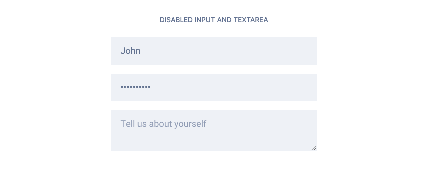
To prevent users from interacting with form fields, just use the disabled HTML attribute.
<input type="text" class="form-input" placeholder="Username" value="John" disabled>
<input type="password" class="form-input" placeholder="Password" value="mypassword" disabled>
<textarea class="form-input" placeholder="Tell us about yourself" disabled></textarea>
It will be passed as a prop in React and Vue.
<Input type="text" placeholder="Username" value="John" disabled />
<Input type="password" placeholder="Password" value="mypassword" disabled />
<Input type="textarea" placeholder="Tell us about yourself" disabled />
<c-input type="text" placeholder="Username" value="John" disabled />
<c-input type="password" placeholder="Password" value="mypassword" disabled />
<c-input type="textarea" placeholder="Tell us about yourself" disabled />With icon
If you want to display an icon into an input tag, follow the example below 👇

<div class="has-icon-left">
    <input class="form-input" type="text" placeholder="Username">
    <svg width="16" height="16" viewBox="0 0 16 16" xmlns="http://www.w3.org/2000/svg">
        <rect width="16" height="16" fill="#909CB5">
    </svg>
</div>
<div class="has-icon-right">
    <input class="form-input" type="text" placeholder="Username">
    <svg width="16" height="16" viewBox="0 0 16 16" xmlns="http://www.w3.org/2000/svg">
        <rect width="16" height="16" fill="#909CB5">
    </svg>
</div>You can use the prop hasIcon in React and has-icon in Vue for obtaining the same result. The SVG needs to be nested into the component.
<Input type="text" hasIcon="left" placeholder="Username">
  <svg width="16" height="16" viewBox="0 0 16 16" xmlns="http://www.w3.org/2000/svg">
    <rect width="16" height="16" fill="#909CB5">
  </svg>
</Input>
<Input type="text" hasIcon="right" placeholder="Username">
  <svg width="16" height="16" viewBox="0 0 16 16" xmlns="http://www.w3.org/2000/svg">
    <rect width="16" height="16" fill="#909CB5">
  </svg>
</Input>
<c-input type="text" has-icon="left" placeholder="Username">
<svg width="16" height="16" viewBox="0 0 16 16" xmlns="http://www.w3.org/2000/svg">
<rect width="16" height="16" fill="#909CB5">
</svg>
</c-input>
<c-input type="text" has-icon="right" placeholder="Username">
<svg width="16" height="16" viewBox="0 0 16 16" xmlns="http://www.w3.org/2000/svg">
<rect width="16" height="16" fill="#909CB5">
</svg>
</c-input>With button
Follow the example below to attach a button on the right side of an input 👇

<div class="form-group">
    <input class="form-input" type="text" placeholder="Username">
    <button class="button button-primary">Button</button>
</div>
<div class="form-group">
    <input class="form-input form-input-sm" type="text" placeholder="Username">
    <button class="button button-primary button-sm">Button</button>
</div>
In React and Vue you 👇
<Input type="text" placeholder="Username">
  <Button color="primary">Button</Button>
</Input>
<Input type="text" size="sm" placeholder="Username">
  <Button color="primary" size="sm">Button</Button>
</Input>
<c-input type="text" placeholder="Username">
<c-button color="primary">Button</c-button>
</c-input>
<c-input type="text" size="sm" placeholder="Username">
<c-button color="primary" size="sm">Button</c-button>
</c-input>Inline on desktop only
If you want to display the button below the form on smaller screens, you can use the .form-group-desktop class 👇
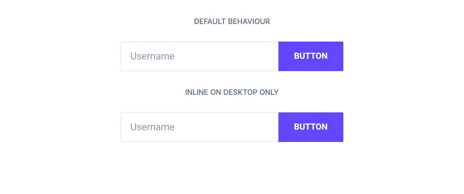
<div class="form-group-desktop">
    <input class="form-input" type="text" placeholder="Username">
    <button class="button button-primary">Button</button>
</div>
<div class="form-group-desktop">
    <input class="form-input form-input-sm" type="text" placeholder="Username">
    <button class="button button-primary button-sm">Button</button>
</div>
Use the formGroup prop in React and form-group in Vue, just like this:
<Input type="text" placeholder="Username" formGroup="desktop">
  <Button color="primary">Button</Button>
</Input>
<Input type="text" size="sm" placeholder="Username" formGroup="desktop">
  <Button color="primary" size="sm">Button</Button>
</Input>
<c-input type="text" placeholder="Username" form-group="desktop">
<c-button color="primary">Button</c-button>
</c-input>
<c-input type="text" size="sm" placeholder="Username" form-group="desktop">
<c-button color="primary" size="sm">Button</c-button>
</c-input>TL;DR
List of available HTML classes
| Class | Description |
|---|---|
.form-input | Required to make input and textarea fit the template style |
.form-success .form-warning .form-error | To make them look different accordingly to their current state |
.form-input-sm | To make them smaller |
.has-icon-left .has-icon-right | Use it on a wrapping <div> to display an icon into an input tag |
.form-group | Use it on a wrapping <div> to attach a button on the right side of an input |
.form-group-desktop | Same as above, but on large screens only |
React props
| Prop | Type | Default | Accepted values |
|---|---|---|---|
label | string | – | – |
labelHidden | boolean | false | – |
type | string | text |
|
name | string | undefined | – |
id | string | null | – |
status | string | – | success, warning, error |
disabled | boolean | false | – |
required | boolean | false | – |
value | string, number | undefined | – |
formGroup | string | null | mobile, desktop |
hasIcon | string | null | left, right |
size | string | – | sm |
placeholder | string | – | – |
rows | number | 3 | Any number |
hint | string | null | – |
Vue props
| Prop | Type | Default | Accepted values |
|---|---|---|---|
label | string | – | – |
label-hidden | boolean | false | – |
type | string | text |
|
name | string | – | – |
id | string | null | – |
status | string | – | success, warning, error |
disabled | boolean | false | – |
required | boolean | false | – |
value | string, number | – | – |
form-group | string | null | mobile, desktop |
has-icon | string | null | left, right |
size | string | – | sm |
placeholder | string | – | – |
rows | number | 3 | Any number |
hint | string | null | – |
Theming
Style is defined into 3 files:
📋 Core file
src/assets/scss/core/elements/_forms.scss
👆🚫 Don’t edit this file!
📋 Settings file
src/assets/scss/settings/elements/_buttons-and-forms.scss
👆 Use this to adjust Sass variables
📋 Theme file
src/assets/scss/theme/elements/_forms.scss
👆 Use this to add custom CSS