While radio and checkbox buttons are always labeled, some developers don’t use any label for their input, textarea and select elements, preferring a placeholder instead.
It’s always a good practice to label a control, but if you don’t want to display it, just use the .screen-reader class like in the example below 👇
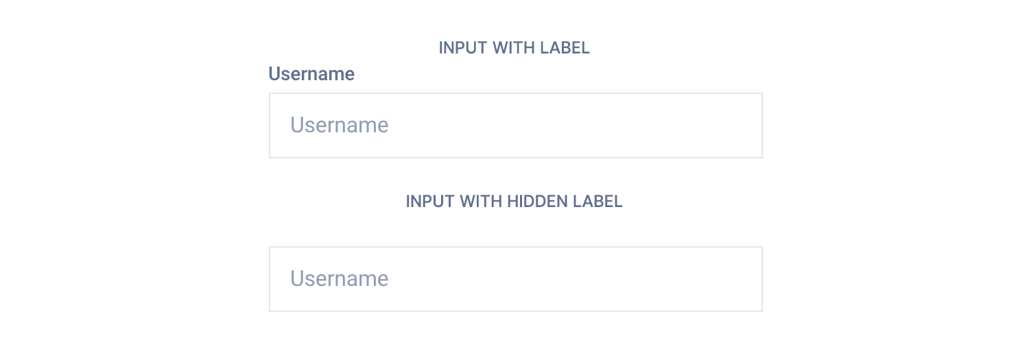
<!-- With label -->
<label for="username" class="form-label">Username</label>
<input id="username" type="text" class="form-input" placeholder="Username">

<!-- Hidden label -->
<label for="username" class="form-label screen-reader">Username</label>
<input id="username" type="text" class="form-input" placeholder="Username">
For React and Vue templates we have provided a label component imported by default into the input and select components, and it can be handled via props.
<!-- With label -->
<Input id="username" type="text" placeholder="Username" label="Username" />

<!-- Hidden label -->
<Input id="username" type="text" placeholder="Username" label="Username" labelHidden />
<!-- With label -->
<c-input id="username" type="text" placeholder="Username" label="Username" />
<!-- Hidden label -->
<c-input id="username" type="text" placeholder="Username" label="Username" label-hidden />TL;DR
List of available HTML classes
| Class | Description |
|---|---|
.form-label | Required to make a label fit the template style |
React and Vue props
Props for labels are:
label– Defines the label contentlabelHidden(React),label-hidden(Vue) – Boolean prop to hide the label
Check out the input and select props lists to know more.
Theming
Style is defined into 3 files:
📋 Core file
src/assets/scss/core/elements/_forms.scss
👆🚫 Don’t edit this file!
📋 Settings file
src/assets/scss/settings/elements/_buttons-and-forms.scss
👆 Use this to adjust Sass variables
📋 Theme file
src/assets/scss/theme/elements/_forms.scss
👆 Use this to add custom CSS